Terracotta Bedroom Color Scheme Ideas & Inspiration

Terracotta Bedroom Color Scheme Ideas That’ll Make You Want to Redecorate Tonight
There’s something about terracotta that feels like a warm hug the moment you walk into a room. It’s earthy, grounding, and surprisingly versatile — and right now, the terracotta bedroom color scheme is having a serious moment in interior design. Whether you’re repainting your walls, switching up your bedding, or planning a full bedroom overhaul, this rich clay-inspired hue can completely transform the way your space looks and feels.
But here’s the thing — terracotta isn’t always easy to work with if you don’t know the rules. Get it wrong, and your room can feel dark and dated. Get it right, and it’s stunning.
This guide walks you through everything: the best color pairings, step-by-step application tips, real design inspiration, and a few common mistakes to avoid. Let’s get into it.
Why Terracotta Works So Well in a Bedroom
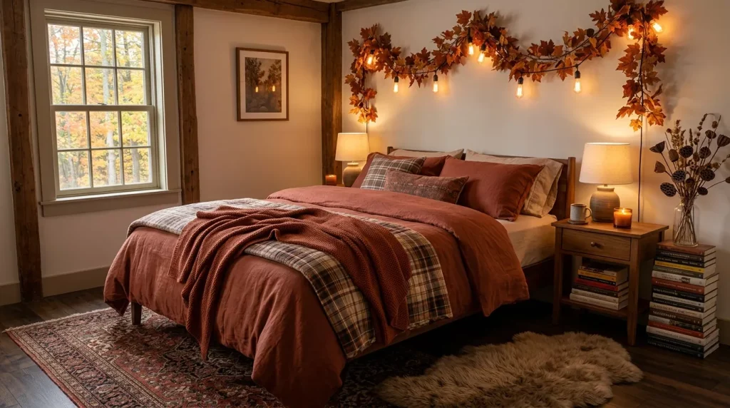
Terracotta is essentially the color of fired clay — a warm, reddish-brown that sits somewhere between rust and burnt sienna. It’s rooted in earthy tones that humans have surrounded themselves with for thousands of years, which is probably why it feels so naturally calming.
In a bedroom specifically, that warmth is a huge advantage. The bedroom is where you wind down, and a color that mimics natural materials like clay, wood, and stone creates a sense of being surrounded by the earth. It promotes coziness without being heavy.
From a design psychology standpoint, warm colors like terracotta lower perceived stress levels. Unlike stark white or cool grey, they make a room feel lived-in and personal — not like a showroom.
Terracotta Bedroom Color Scheme Ideas That Actually Work

1. Terracotta and White: The Classic Contrast
This is probably the most beginner-friendly combination out there. Pairing terracotta with crisp white immediately balances the warmth of the clay tones with freshness and light.
How to use it:
- Paint your accent wall terracotta and keep the remaining three walls white
- Use white linen bedding to let the wall be the hero
- Add natural wooden furniture — oak or pine works beautifully here
- Incorporate white ceramic accessories and a terracotta-toned throw
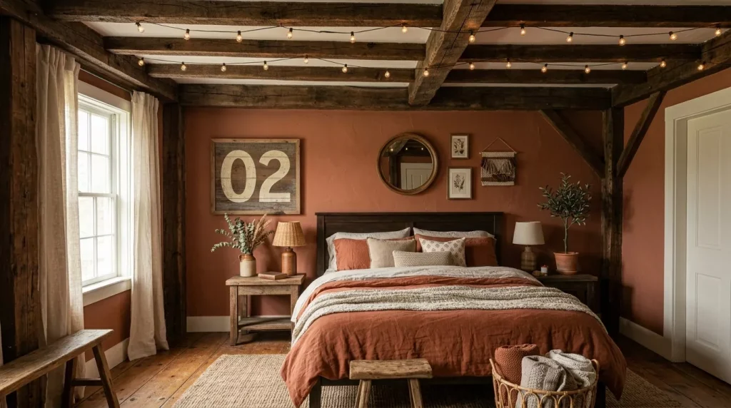
This pairing works especially well in smaller bedrooms because the white walls prevent the space from feeling closed in, while the terracotta accent adds personality.
2. Terracotta and Sage Green: An Earthy Dream
If you’re after something a little more curated and bohemian, this duo is everything. Sage green and terracotta are both organic, nature-inspired tones that feel like they belong together — almost like a terracotta pot sitting on a garden bench.
What makes it work: The undertones of both colours share similar earthy qualities. Neither one overpowers the other; they coexist in that sweet spot between bold and muted.
Ideas for this scheme:

- Terracotta walls with sage green bedding and pillowcases
- A sage green velvet headboard against a terracotta accent wall
- Woven jute rugs, rattan furniture, and potted plants to complete the boho look
- Linen curtains in an olive or dusty sage shade
This is a stunning combination for anyone who loves a Moroccan, Mediterranean, or Scandinavian-boho aesthetic.
3. Terracotta and Cream/Beige: The Warm and Cozy Route
Not everyone wants high contrast. If soft, layered warmth is what you’re going for, pairing terracotta with cream and beige tones is the way to do it.
Think of the color palette of a Tuscan villa — warm plaster walls, linen drapes, honey-toned wood. That’s exactly the energy this combination delivers.
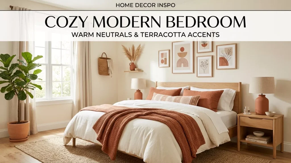
Layer it like a pro:
- Use a lighter terracotta (more salmon, less brick) on the walls
- Dress the bed in cream, oat, and warm white textiles
- Add beige woven cushions and a camel-colored knit throw
- Choose warm brass or brushed gold hardware for fixtures and mirrors
The result is a bedroom that feels like a sanctuary — warm, soft, and almost Mediterranean in its ease.
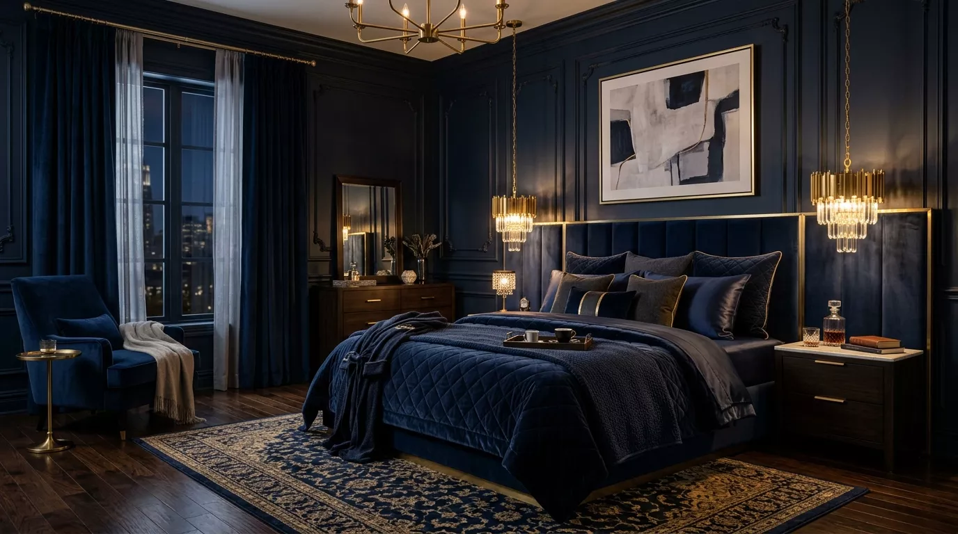
4. Terracotta and Navy Blue: Bold and Beautiful
This one surprises a lot of people. Deep navy and terracotta are complementary in the best possible way — the blue cools down the terracotta’s intensity, while the terracotta brings life to what might otherwise be a serious, moody palette.

Best approaches:
- Keep walls terracotta and introduce navy through bedding, cushions, or a bedroom bench
- Use a navy statement headboard against a softer terracotta wall
- Add deep blue velvet curtains for drama and warmth
- Balance with natural timber tones and metallic accents in gold or antique brass
This combo is perfect for those who love personality and aren’t afraid to make a visual statement.
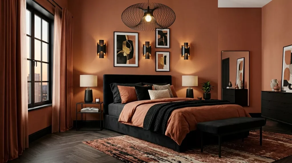
5. Terracotta and Charcoal Grey: Modern Earthiness
For a more contemporary feel, charcoal grey is a brilliant foil for terracotta. It grounds the warmth of the clay tones and adds a sleek, modern edge to what might otherwise lean too rustic.
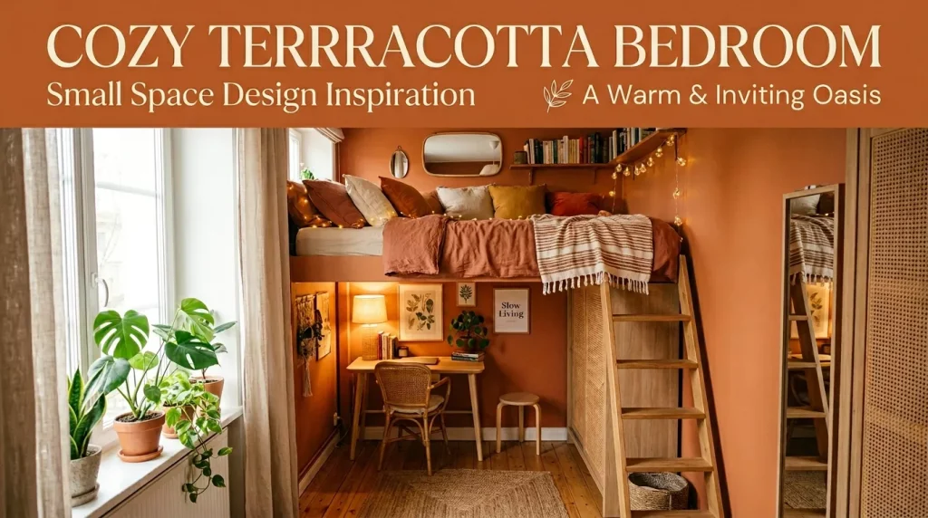
How to pull it off:
- Use terracotta as the wall color and charcoal for the headboard, bedframe, or furniture
- Choose grey concrete-look accessories or matte black fixtures
- Layer in textiles — terracotta cushions, grey linen bedding, a cream throw
- Avoid too much black; keep the greys soft and smoky rather than harsh
This is the scheme for minimalist-leaning design lovers who still want warmth in their space.
Terracotta Color Pairings at a Glance

| Paired Color | Mood Created | Best For | Difficulty |
|---|---|---|---|
| White | Fresh & airy | Small bedrooms, beginners | Easy |
| Sage Green | Earthy & bohemian | Nature lovers, boho style | Easy |
| Cream/Beige | Warm & luxurious | Cozy/Mediterranean vibes | Easy |
| Navy Blue | Bold & sophisticated | Statement spaces | Moderate |
| Charcoal Grey | Modern & grounded | Contemporary aesthetics | Moderate |
| Blush Pink | Romantic & feminine | Soft, dreamy bedrooms | Easy |
| Forest Green | Rich & moody | Dark luxe aesthetic | Moderate |
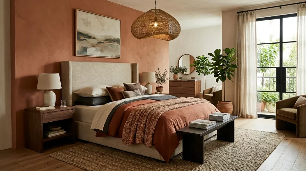
How to Apply a Terracotta Bedroom Color Scheme: Step-by-Step Guide
Not sure where to start? Here’s a simple process to follow whether you’re going all in or just dipping your toes in.
Step 1: Choose Your Terracotta Shade Not all terracotta is the same. Lighter shades lean more salmon or peach, mid-tones are the classic clay/brick, and darker versions read almost rusty-brown. Pick your shade based on how much natural light your bedroom gets. Darker rooms benefit from lighter, warmer terracotta; sun-drenched rooms can handle deeper, richer tones.
Step 2: Decide How Much Terracotta You Want You have three main options:

- Full commitment — paint all four walls (works best with high ceilings)
- Accent wall — one statement wall behind the headboard
- Accessory approach — no paint at all; just terracotta through textiles and decor
Step 3: Pick Your Complementary Colors Use the pairing table above. If you’re a beginner, start with white or cream to play it safe. Once you’re comfortable, explore sage green or navy for more character.
Step 4: Start with the Big Surfaces First Walls and flooring are your foundation. If painting, apply a primer coat first — terracotta pigments sometimes need two coats to reach full saturation. Work from the top down.
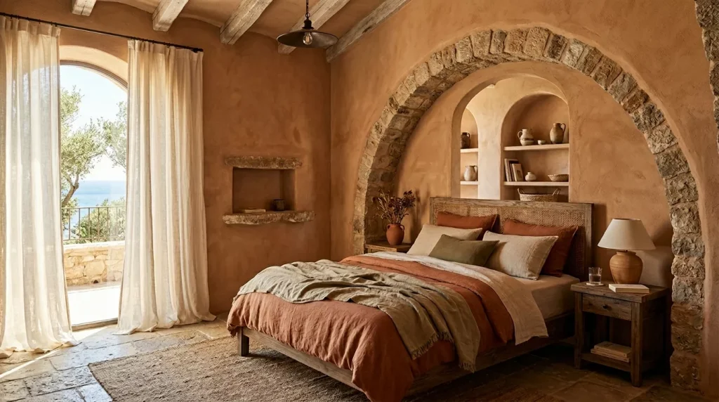
Step 5: Layer In Textiles Bedding is your next biggest opportunity. Start with your main duvet cover and pillowcases, then layer in cushions, throws, and a rug. Texture matters as much as color here — linen, cotton, and woven materials all reinforce that earthy, organic feel.
Step 6: Add Furniture and Accessories Stick to natural materials where possible — rattan, raw wood, stone, ceramic, and wicker all complement terracotta beautifully. Avoid anything too shiny or plastic-looking; it’ll undercut the warmth.
Step 7: Get the Lighting Right Warm-toned bulbs (2700K–3000K) will make your terracotta walls glow in the evening. Avoid cool white or daylight bulbs — they’ll make the space feel clinical and will wash out the warmth you’ve worked so hard to create.
Pros and Cons of a Terracotta Bedroom Color Scheme

Pros
- Creates instant warmth and a cozy, inviting atmosphere
- Works beautifully with natural materials like wood, rattan, and linen
- Extremely versatile — pairs with dozens of other colors
- Timeless appeal; unlike many trends, earthy tones never fully go out of style
- Works well in both large and small spaces (with the right approach)
- Flattering to skin tones under warm lighting
Cons
- Can feel heavy or dark in rooms with limited natural light
- Requires careful balancing — too much terracotta can feel overwhelming
- Not suited to everyone’s taste; some find it too rustic or warm
- May clash with cool-toned existing furniture (grey, chrome, etc.)
- Darker terracotta shades can be harder to paint over later
Common Mistakes to Avoid
Getting your terracotta bedroom wrong is easier than you’d think. Here are the mistakes most people make — and how to sidestep them.
Using too many warm tones at once. Layering terracotta with rust, burnt orange, and mustard can create a room that feels like it’s on fire. Always balance warm tones with at least one cooler or neutral color.
Ignoring the undertones. Terracotta can have pink, orange, or red undertones. Always test a paint swatch on your actual wall and look at it in both daylight and evening light before committing.
Forgetting about contrast. A room with no contrast feels flat. Even if your entire palette is warm and earthy, you need some variation in value (light versus dark) to give the room visual interest.
Skipping the primer. Deep terracotta pigments are notorious for uneven coverage without a quality primer first. Don’t skip this step — you’ll end up using twice as much paint.
Choosing the wrong lighting. Cool LED bulbs are the fastest way to ruin a terracotta room. Always test your lighting alongside your paint and textiles before finalizing anything.
Going too matchy-matchy. Matching your terracotta wall to terracotta accessories to terracotta bedding makes a room feel like a branded hotel lobby. Vary your materials and tones.
Expert Tips for a Stunning Terracotta Bedroom
- Test swatches at different times of day. Terracotta looks completely different at 9am versus 9pm. Always judge your paint choice under multiple lighting conditions.
- Use the 60-30-10 rule. Let your dominant color (white, cream, or neutral) cover 60% of the room, terracotta take up 30%, and a bold accent color fill the remaining 10%.
- Plants are your best friend. Greenery amplifies the natural, earthy quality of terracotta better than any accessory. A few potted plants in terracotta pots is the perfect finishing touch.
- Mix textures. Smooth plaster walls, chunky knit throws, matte ceramics, and rough-hewn wood create a rich tactile landscape that makes the color scheme feel layered and intentional.
- Don’t overlook the ceiling. A ceiling painted in a pale blush or warm white rather than standard ceiling white will tie the whole room together in a subtle but beautiful way.
- Sample before committing. Paint at least an A4-sized swatch directly on the wall. Look at it for a full 48 hours before making a final decision.
Conclusion: Your Dream Terracotta Bedroom Is Closer Than You Think
The terracotta bedroom color scheme isn’t just a trend — it’s a design choice rooted in warmth, nature, and timeless human aesthetics. Whether you go bold with rust-toned walls or keep things subtle with terracotta-toned textiles and accessories, this earthy palette has the power to transform an ordinary bedroom into something that genuinely feels like a haven.
The key is in the details: the right complementary colors, balanced contrast, layered textures, and warm lighting. Get those right, and terracotta will reward you with a bedroom that feels both beautiful and deeply personal.
Ready to start? Pick one element — maybe a terracotta throw pillow or a single accent wall — and see how it feels. Sometimes the best design decisions begin with just one small, earthy step.
Frequently Asked Questions (FAQs)
Q1. Is terracotta a good color for a small bedroom?
Yes, absolutely — with the right approach. In a small bedroom, avoid painting all four walls a deep terracotta, as it can make the room feel smaller. Instead, use terracotta on a single accent wall (ideally the one behind the headboard) and keep the other walls white or cream. This way you get the warmth without the visual weight.
Q2. What colors go best with terracotta in a bedroom?
Terracotta pairs beautifully with white, cream, sage green, navy blue, charcoal grey, blush pink, and forest green. For a natural, earthy look, go with cream and sage. For something bolder and more sophisticated, try navy or charcoal. White is the safest and most versatile pairing for beginners.
Q3. Does terracotta go with grey furniture?
It depends on the grey. Warm or mid-toned greys (like greige or mushroom) work wonderfully alongside terracotta — they share similar warmth. Cool or very dark charcoal grey furniture can clash unless balanced carefully with earthy accessories in between. Adding natural wood elements helps bridge any visual tension.
Q4. What bedding goes with terracotta walls?
White linen, cream cotton, and warm beige bedding all look gorgeous against terracotta walls. If you want more contrast, dusty sage green or navy blue bedding creates a striking but complementary effect. Avoid bedding with cool blues or greens (like teal or aqua), as they’ll fight the warmth of the wall color.
Q5. Is terracotta a timeless color or just a trend?
Terracotta is genuinely timeless. It has been used in art, architecture, and interiors for thousands of years — from Ancient Rome to Moroccan riads to Spanish Colonial homes. While its popularity may ebb and flow in mainstream interior design trends, earthy, clay-based tones never truly go out of style. If you invest in it, you’re unlikely to regret it a few years down the line.
Q6. How do I keep a terracotta bedroom from feeling too dark?
Use plenty of natural and warm artificial light, keep a significant portion of the room (walls, textiles, flooring) in lighter neutral tones, and incorporate reflective surfaces like mirrors or metallic accents. Sheer curtains rather than heavy drapes will also help maximize natural light during the day.
Q7. Can I mix terracotta with other warm tones like mustard or rust?
You can, but with caution. The trick is to avoid putting all warm-toned colors at full saturation together. If you’re mixing terracotta with mustard or rust, keep one of them very muted or use it sparingly as an accent. Grounding the palette with cream, white, or natural wood helps prevent the space from feeling overpowering.