Neutral Bedroom Color Palette Ideas for a Calm Space

Neutral Bedroom Color Palette Ideas for a Calm, Beautiful Space
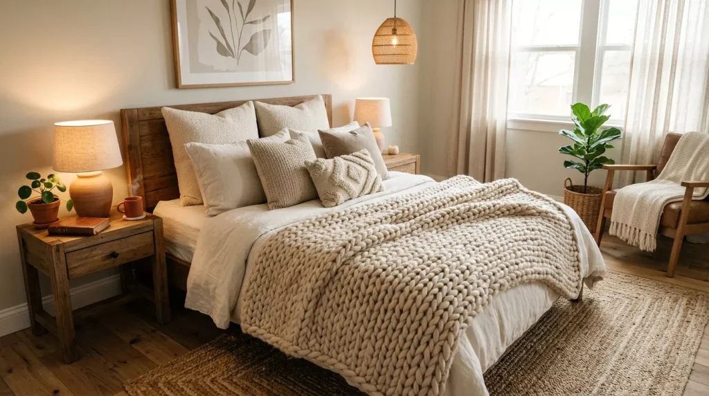
Walk into a bedroom with a well-executed neutral color palette and you’ll immediately feel the difference. The shoulders drop. The breath slows. There’s something almost physiological about a well-done neutral bedroom — it doesn’t demand anything from you, and that’s exactly the point.
Neutral bedroom color palette ideas have surged in popularity for good reason. In a world full of noise and visual stimulation, the bedroom should function as a proper sanctuary. And neutrals — when done thoughtfully — deliver that better than almost any other approach.
But here’s the thing: “neutral” doesn’t mean boring. It doesn’t mean beige walls and a white duvet and calling it a day. Done right, a neutral bedroom is layered, textured, warm, and deeply personal. This guide will show you exactly how to get there.
Why Neutral Color Palettes Work So Well in Bedrooms
The bedroom isn’t a space you perform in — it’s a space you recover in. That single fact shapes everything about how it should be designed.
Neutral tones work so well in bedrooms because they don’t compete for attention. There’s no bold color shouting at you when you’re trying to wind down, no saturated hue that feels energizing when you’re trying to sleep. Neutral colors act like a visual exhale — they give your brain permission to switch off.
From a design standpoint, neutrals also have a longer shelf life than trend-driven colors. A warm greige bedroom won’t look dated in five years the way a teal accent wall might. That makes neutrals a smart long-term investment, not just an aesthetic choice.
Other reasons neutrals dominate bedroom design:
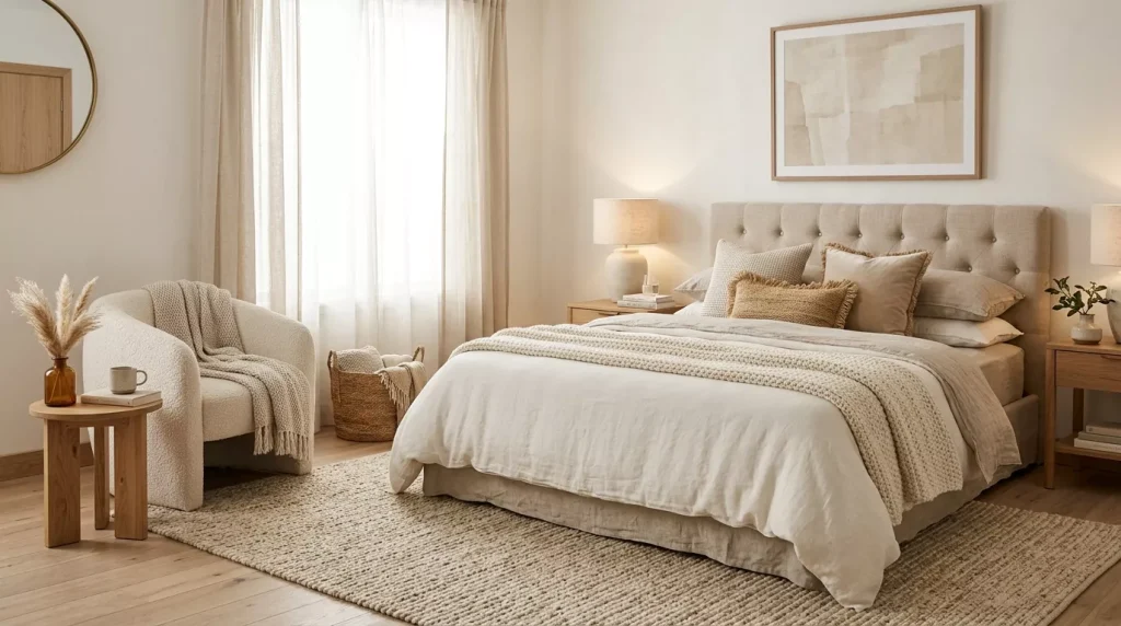
- They create a naturally cohesive look even when mixing different furniture styles
- They adapt across seasons — feels cozy in winter, light and airy in summer
- They make it easier to change up accessories without a full redesign
- They suit almost any bedroom size — light neutrals expand, deeper neutrals add intimacy
- They work with every wood tone, metal finish, and fabric type
Understanding the Neutral Spectrum: Not All Neutrals Are Equal
This is where most people get unstuck. They think “neutral” means any beige or white, and then wonder why their room doesn’t look right. The reality is that neutrals have undertones — and getting those undertones right makes or breaks the whole palette.
The three main categories of neutrals:
Warm Neutrals
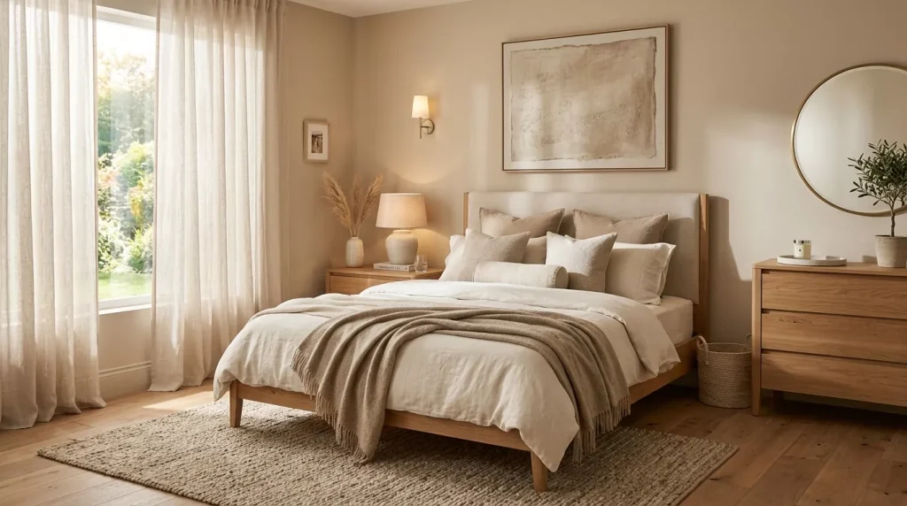
These include creams, warm whites, sandy beiges, caramels, taupes, and warm greiges. Their undertones lean toward yellow, orange, or red. They feel cozy, enveloping, and inviting — particularly flattering in artificial light.
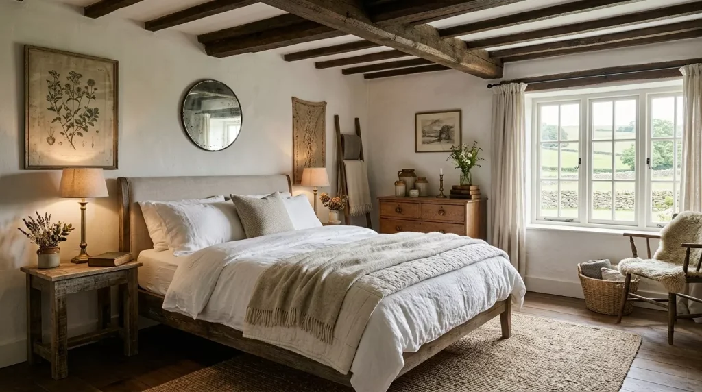
Warm neutral bedrooms feel like a hug. Think of the aesthetic you’d find in a luxury countryside retreat — linen sheets in oat tones, exposed wooden beams, a knitted throw in caramel, walls the color of freshly baked shortbread.
Popular warm neutral paint shades:

- Farrow & Ball Elephant’s Breath – A warm grey with pink undertones
- Benjamin Moore Pale Oak – A golden-beige that transitions beautifully in natural light
- Dulux Almond White – Creamy and soft without being yellowy
- Sherwin-Williams Accessible Beige – The warm beige that works almost everywhere
Cool Neutrals
These include soft whites, cloud greys, blue-greys, pale greiges with blue bases, and cooler taupes. Their undertones lean toward blue, green, or purple. They feel clean, fresh, and calm — almost spa-like.
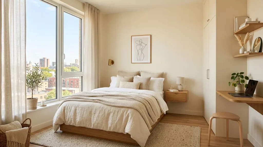
Cool neutral bedrooms have an elegant restraint to them. Think Scandinavian design principles — minimal, intentional, quietly beautiful. White walls with just a hint of grey, linen bedding in icy blue-white, silver accents, and uncluttered surfaces.
Popular cool neutral paint shades:
- Farrow & Ball Skimming Stone – A pale greige with cool grey leanings
- Sherwin-Williams Agreeable Gray – One of the most popular neutrals for good reason
- Benjamin Moore Classic Gray – Cool, sophisticated, incredibly versatile
- Dulux Pebble Shore – A clean, cool-toned neutral for modern spaces

Greige and Earthy Neutrals
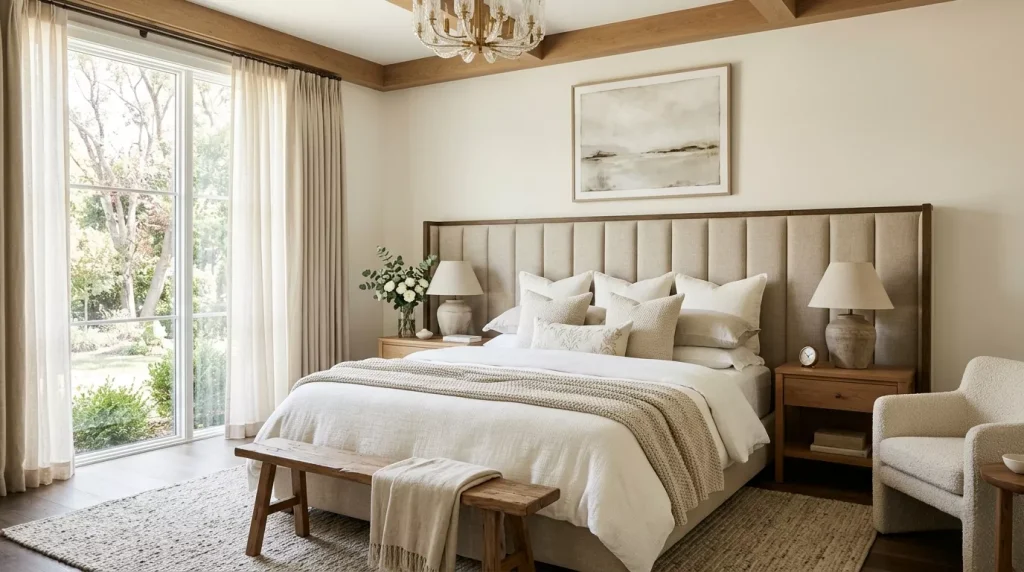
Greige — the now-famous grey-beige hybrid — sits between warm and cool, making it one of the most flexible neutral tones available. Earthy neutrals like clay, terracotta, warm stone, sand, and linen also fall here.
These tones are having a genuine design renaissance right now. There’s a deep, organic richness to an earthy neutral bedroom that neither cold greys nor pale beiges can replicate. They feel grounded, grown-up, and deeply relaxing.
Popular greige and earthy neutral paint shades:

- Farrow & Ball Dead Salmon – An unusual, warm clay-pink neutral
- Sherwin-Williams Antique White – A warm, slightly peach-toned ivory
- Benjamin Moore Revere Pewter – The original greige, still a firm favourite
- Little Greene Slaked Lime – A warm limewash-inspired neutral with depth
Neutral Bedroom Color Palette Ideas: Combinations That Actually Work
Knowing which neutrals to pair together — and which secondary tones to bring in — is the difference between a neutral bedroom that feels designed and one that just feels beige.

Here’s a comparison of the best neutral bedroom palette combinations:
| Palette Name | Primary Neutral | Accent Tones | Best Style Match |
|---|---|---|---|
| Warm Linen | Warm white / oat | Caramel, natural wood, cream | Farmhouse, Scandi |
| Stone & Slate | Cool greige | Charcoal, soft black, silver | Modern, minimalist |
| Desert Earth | Sandy beige / clay | Terracotta, olive, burnt sienna | Boho, Mediterranean |
| Nordic Frost | Soft grey-white | Pale blue, ice white, chrome | Scandinavian, coastal |
| Moody Taupe | Deep warm taupe | Chocolate brown, brass, ivory | Traditional, maximalist |
| Soft Greige | Mid greige | Dusty pink, warm gold, sage | Transitional, contemporary |
| Ivory & Oak | Cream / ivory | Warm oak wood, soft tan, black | Japandi, organic modern |
| Cloud White | Warm off-white | Dove grey, linen, rattan | Classic, light-filled spaces |
The golden rule? Pick one primary neutral for walls and large surfaces, then layer two to three secondary tones through soft furnishings, wood, and metal accents.

Neutral Bedroom Color Palette Ideas by Style
The Warm and Organic Neutral Bedroom
This style is all about bringing the outside in. Think natural materials — jute, rattan, unbleached linen, solid oak — paired with a warm white or sandy beige on the walls. This palette feels handcrafted and unhurried.
Key elements:
- Oat or warm cream linen bedding with relaxed, un-ironed texture
- Solid wood bedframe in natural oak or walnut
- Jute or wool rug in a tone-on-tone neutral
- Dried botanical arrangements — pampas grass, dried lavender, eucalyptus
- Woven wall basket or ceramic artwork in natural tones
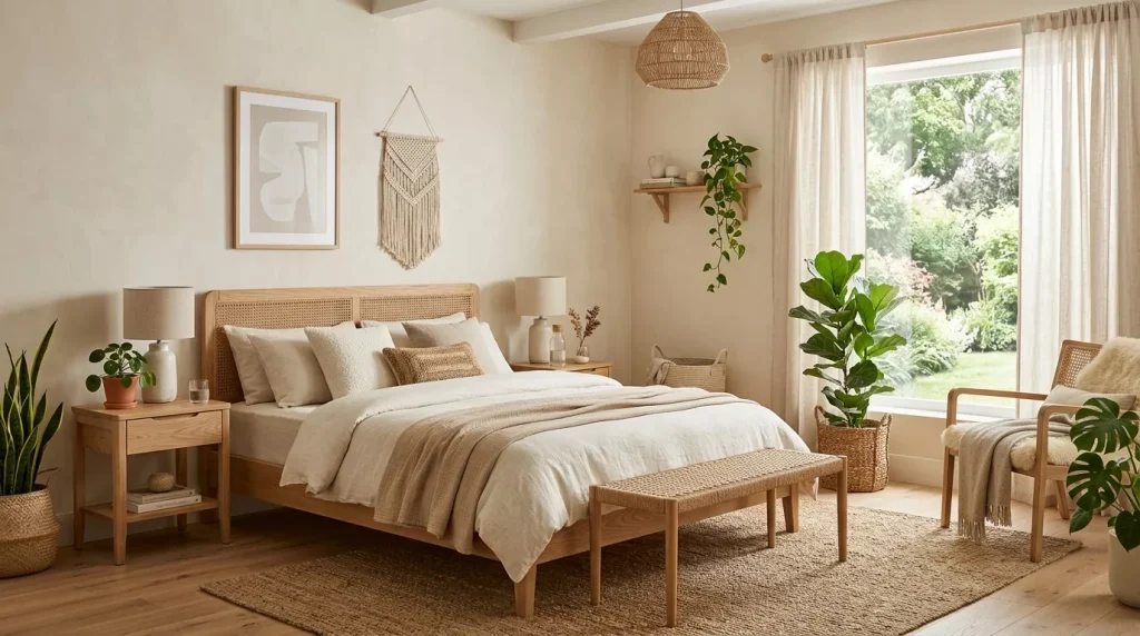
The organic neutral bedroom is particularly powerful in rooms that receive warm afternoon light — the sun hits those sandy tones and turns the whole room golden.
The Minimal Neutral Bedroom
Less is genuinely more in this style. A minimal neutral bedroom has fewer pieces, chosen carefully, with clean lines and deliberate negative space. The palette might be just two tones — a soft grey-white wall and warm linen bedding — but the room feels completely finished because every element earns its place.
Key elements:

- Low-profile platform bed in natural wood or upholstered in cream
- Single large pendant light rather than multiple smaller ones
- One piece of considered wall art rather than a gallery wall
- A single textured throw at the foot of the bed
- Hidden storage to eliminate visual clutter
The challenge with minimal neutral bedrooms is resisting the urge to add more. When in doubt, remove something rather than adding it.
The Layered Cozy Neutral Bedroom

This style is about maximising comfort and warmth through texture. The palette may still be entirely neutral — cream, taupe, warm white, soft oat — but the room feels rich and enveloping because of how many different textures are at play.
Think chunky knit cushions, a velvet throw, a linen duvet, a faux fur accent at the foot of the bed, a boucle armchair in the corner. Each piece is a slightly different shade of neutral, and the variation creates visual depth without any colour contrast.
Key elements:
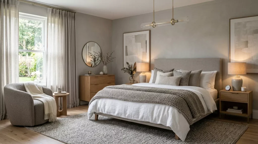
- Layered bedding — base sheet, duvet, quilt, throw, minimum three pillow sizes
- Upholstered headboard in bouclé or soft linen
- Warm-toned lighting — table lamps on both sides of the bed with warm bulbs
- Curtains in full-length linen that pool slightly on the floor
- A mix of matte ceramic, rough-textured wood, and soft fabric surfaces
The Japandi Neutral Bedroom
Japandi — the now well-established blend of Japanese and Scandinavian design principles — is built almost entirely on neutral palettes. It pairs the warmth of natural wood with the restraint of cool whites and greys, creating a space that feels both minimal and quietly luxurious.

Key elements:
- Low wooden bed frame with clean, linear lines
- White or very pale grey walls with no decorative clutter
- Warm wood tones — maple, bamboo, or light walnut
- Functional accessories only — a single ceramic lamp, one small plant
- Linen or cotton bedding in warm off-white, barely there blush, or soft grey
Neutral Bedroom Color Palette: Pros and Cons
Pros

- Timeless and enduring — won’t look dated as trends shift
- Versatile base — easy to update with seasonal accessories or changing tastes
- Promotes genuine relaxation — absence of strong color reduces visual stimulation
- Works in any size room — adjust the depth of tone to suit the proportions
- Cohesive look with less effort — neutrals naturally sit well together
- Flexible with furniture styles — contemporary, vintage, and rustic pieces all work
- Easier to sell — if you’re a homeowner, neutral bedrooms appeal to more buyers
Cons
- Can feel flat if not layered — without texture variation, neutral rooms look unfinished
- Gets dirty more visibly — cream and white bedding, sofas, and rugs show marks more easily
- Requires lighting attention — poor lighting makes neutrals look grey and lifeless
- Undertone confusion — mixing warm and cool neutrals without care looks messy
- Limited wow factor — bold color lovers may find neutral rooms lacking personality
- More about execution — a neutral bedroom depends heavily on quality materials and careful layering
Step-by-Step Guide: Building a Neutral Bedroom Color Palette
Whether you’re starting from scratch or reworking an existing room, here’s a clear process to follow:
Step 1: Assess Your Room’s Fixed Elements Look at your flooring, existing furniture you’re keeping, and the direction your windows face. These fixed elements will heavily influence which neutral family works best. Warm wood floors? Go warm neutral. Cool grey tile flooring? A warm neutral will balance it; a cool neutral might make it feel cold.
Step 2: Determine Your Neutral Family Based on your fixed elements and personal preference, decide whether you’re going warm, cool, or earthy. Don’t mix warm and cool tones until you’re confident — stick to one family when you’re starting out.
Step 3: Choose Your Primary Neutral for Walls Paint is the single biggest visual element in any room. Spend time choosing it properly — buy at least three sample pots, paint large swatches (ideally 30cm x 30cm), and observe them at different times of day and under your bedroom’s artificial lighting before committing.
Step 4: Select Your Bedding Palette Your bed is the focal point of the room. Choose bedding in two or three tones within your neutral family — for example, warm white base, oat duvet, and a caramel throw. Vary the textures even if the tones are similar.
Step 5: Choose Your Wood and Metal Tones Pick one dominant wood tone (light, medium, or dark) and stick to it across your furniture. For metals — bedside lamp bases, handles, mirror frames — choose one finish (brass, matte black, antique silver) and repeat it throughout.
Step 6: Layer in Soft Furnishings Add cushions, curtains, rugs, and throws. These should sit within your chosen neutral family but bring in texture variation — linen, velvet, knit, cotton, wool. This is what transforms a room from beige to beautiful.
Step 7: Add Organic and Decorative Elements Finish with a few considered accessories — a simple ceramic lamp, a woven basket, a plant, a framed artwork. In neutral bedrooms, restraint is a virtue. Aim for three to five decorative items total rather than filling every surface.
Tips for a Stunning Neutral Bedroom
- Test paint in natural and artificial light — the same neutral can look completely different at 9am versus 9pm
- Invest in quality bedding — in a neutral room, materials are on full display; cheap polyester looks terrible against beautiful walls
- Use varying pile heights in textiles — a flat-woven rug, a plush throw, and a matte-finish cushion create dimension
- Repeat tones deliberately — use your secondary accent tone in at least three places for it to look intentional
- Add a dark anchor — in very pale neutral rooms, add one dark element (a matte black lamp, dark wood shelf) to prevent the room from feeling washed out
- Don’t overlook the ceiling — paint it in a tone slightly lighter than your walls, not stark white, to create a sense of height without harshness
- Layer your lighting — overhead light, two bedside lamps, and a floor or table lamp creates atmospheric flexibility
- Bring in natural elements — wood, stone, plants, and dried botanicals give neutral bedrooms a living quality that manufactured accessories can’t replicate
Common Mistakes to Avoid in Neutral Bedroom Decorating
Even with the best intentions, neutral bedroom palettes go wrong in some very predictable ways. Here’s what to watch for:
Mistake 1: Mixing Warm and Cool Neutrals Without Anchoring This is the most common issue. A warm cream duvet against a cool grey-white wall looks off — the two neutrals fight each other. Learn your undertones, pick a family, and stay within it unless you’re deliberately bridging with a greige.
Mistake 2: No Texture Variation A room where everything is the same shade of beige and the same texture feels flat and uninspiring. The magic of neutral rooms is in the texture contrast — matte plaster walls, smooth linen sheets, rough linen cushions, a glossy ceramic base, a wood grain headboard.
Mistake 3: Skimping on Curtains Thin, short curtains ruin neutral bedrooms. Invest in full-length linen or cotton curtains that hang from ceiling to floor. They make the room look taller, warmer, and more finished than any other single upgrade.
Mistake 4: Choosing a Neutral That’s Too Dark for the Room Dark neutrals like deep taupe, warm chocolate, and rich stone can be spectacular — but not in a small, poorly lit room. If your bedroom is compact or low on natural light, keep walls in the lighter end of your neutral family and save darker tones for a single feature wall or soft furnishings.
Mistake 5: Too Much White Without Warmth Pure bright white bedrooms look stunning in sunlit photographs and exhausting in real life. Add warmth through warm-white bulbs, natural wood tones, and off-white or cream textiles to prevent the room from feeling like a blank canvas.
Mistake 6: Forgetting About Scale In a large neutral bedroom, small accessories get lost and the space feels cold. Scale your artwork, rugs, and cushions to the room size. A large bedroom needs a generously sized rug, a substantial headboard, and statement-sized artwork — not a collection of small pieces scattered around.
FAQs: Neutral Bedroom Color Palette Ideas
Q1. What is the most popular neutral color for a bedroom?
Warm white and greige consistently top the charts for bedroom neutrals. Specific shades like Sherwin-Williams Agreeable Gray, Benjamin Moore White Dove, and Farrow & Ball Elephant’s Breath appear in countless designer bedrooms because they deliver warmth, flexibility, and a genuinely calming quality. The “most popular” shade, though, should always be calibrated to your room’s specific light conditions and fixed elements — what works brilliantly in a north-facing room might feel flat in a south-facing one.
Q2. How do I make a neutral bedroom feel warm rather than cold?
Warmth in a neutral bedroom comes from three main sources: warm undertones in your paint choice, warm-toned artificial lighting (2700K–3000K bulbs), and layered organic textures. Natural wood, jute, linen, wool, and ceramic all read as warm materials regardless of their color. Avoid cool-toned whites, chrome finishes, and cold grey stone if warmth is your priority. Even one warm wood element — a bedside table, a picture frame, a wooden bowl — can shift a room from clinical to inviting.
Q3. Can I add color to a neutral bedroom without losing the calm feel?
Absolutely. The key is choosing colors that are themselves muted and earthy rather than bright and saturated. Dusty sage green, muted terracotta, soft blush, smoky blue — these are colors, but they behave like enhanced neutrals when used alongside a quiet base palette. Keep your walls and large furniture in neutrals and use these muted tones in cushions, throws, artwork, and plants. You get visual interest without sacrificing the restful quality that makes neutral bedrooms so appealing.
Q4. What bedding colors work best in a neutral bedroom?
The most versatile bedding choices for neutral bedrooms are warm white, oat, cream, linen-tone, and soft greige. Natural linen bedding — either undyed or in an oat/pebble tone — is particularly popular because its relaxed texture adds warmth and the material itself speaks to the organic, calm quality of neutral design. Avoid very bright white (it can look clinical) or very dark bedding (it can feel heavy) unless you’re going for a specific moody neutral aesthetic.
Q5. How do I stop a neutral bedroom from looking boring?
Texture is your answer. A neutral bedroom only looks boring when everything in it is the same tone and the same finish. Introduce variety through: a chunky knit cushion, a smooth ceramic lamp base, a rough-textured linen headboard, a woven jute rug, a matte-painted wall, a glossy picture frame. When all of those surfaces catch the light differently, the room becomes visually rich even without any color contrast. Also ensure your lighting has warmth and layers — overhead plus bedside plus ambient.
Q6. Should bedroom curtains match the walls in a neutral palette?
Not necessarily, but they should sit within the same neutral family. Curtains that are a slightly warmer or slightly deeper version of your wall color add gentle visual contrast while maintaining cohesion. Full-length linen curtains in a natural, warm tone work beautifully against almost any neutral wall color. Avoid very stark white curtains against warm cream walls — the contrast can feel jarring. And avoid very dark curtains unless you’re going for a deliberately dramatic look.
Q7. What is the best neutral color palette for a small bedroom?
In a small bedroom, lighter neutrals always help. Warm white, soft cream, and pale greige all reflect more light and make walls feel further away. Use the same neutral on walls and ceiling to remove the visual ‘box’ effect. Choose furniture in light wood tones rather than dark, keep the floor as visible as possible with a smaller or no rug, and use mirrors to bounce light. If you want depth, bring it through cushions and throws rather than wall color.
Conclusion: Your Neutral Bedroom Awaits
Building the perfect neutral bedroom color palette isn’t about choosing the most popular shade on Pinterest or copying a room you saw in a magazine. It’s about understanding your space — its light, its proportions, its fixed elements — and making deliberate choices that serve the way you actually want to feel when you walk through the door.
A well-executed neutral bedroom color palette rewards patience and attention to detail. Get the undertones right. Invest in texture. Layer your lighting. And resist the urge to fill every surface.
The result is a bedroom that looks beautiful in photographs and feels even better in person — a space that genuinely restores you, night after night.
Start with one element today. Pick up three paint samples, order a new linen throw, or simply clear the surfaces of anything that doesn’t belong. Your calm, beautiful bedroom is closer than you think — and it starts with a single, considered choice.