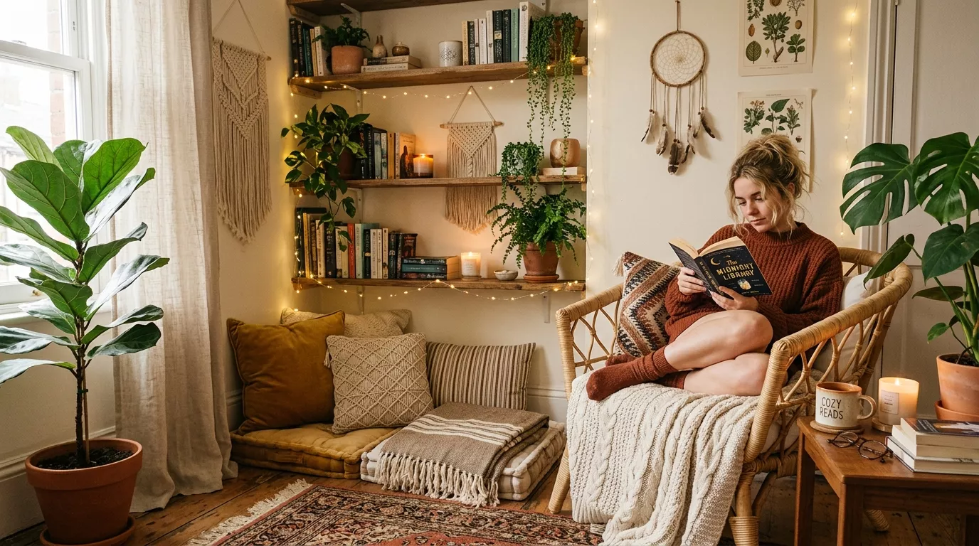
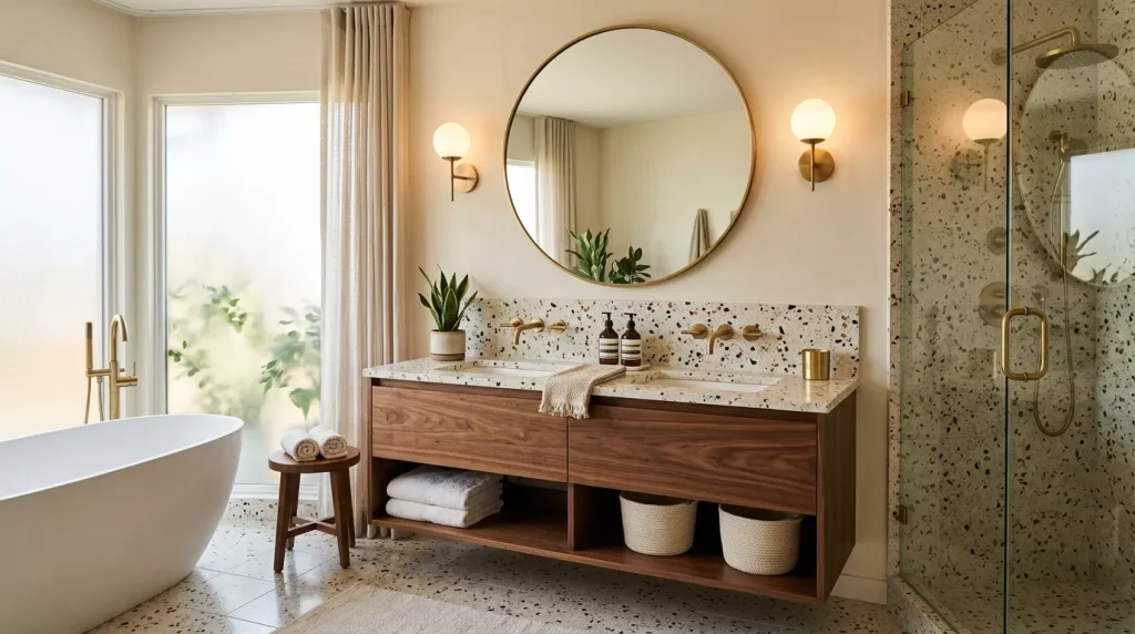
Terracotta Home Decor Color Scheme Ideas to Try Now

Terracotta Home Decor Color Scheme Ideas to Transform Any Room
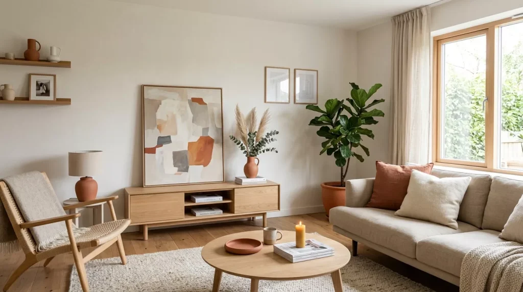
If you’ve been scrolling through interior design feeds lately, you’ve probably noticed one color showing up everywhere — terracotta. Warm, earthy, and undeniably inviting, terracotta home decor color scheme ideas have taken over living rooms, bedrooms, and even bathrooms. And honestly? It makes complete sense.
This isn’t just a passing trend. Terracotta’s deep roots in nature and culture give it a timeless quality that most other trending colors simply can’t match. Whether you’re repainting a whole room or just refreshing your throw pillows, this guide will walk you through everything you need to know to work terracotta into your home beautifully.
Why Terracotta Is Dominating Interior Design Right Now
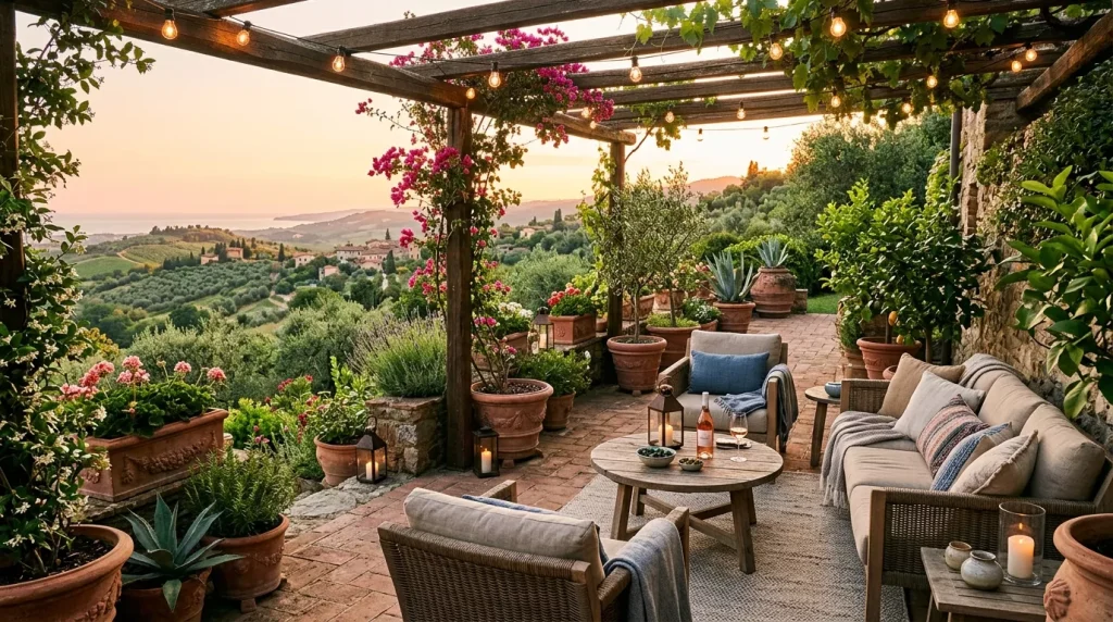
Terracotta — which literally means “baked earth” in Italian — is a warm, reddish-orange hue inspired by clay pottery, desert landscapes, and sun-dried tiles. It’s been used in architecture and pottery for thousands of years, from ancient Mediterranean homes to Moroccan riads, but it’s had a serious renaissance in modern interior design.
People are craving warmth. After years of cold minimalist whites and grays dominating home decor, there’s a real hunger for color that feels alive, cozy, and personal. Terracotta delivers exactly that. It wraps a room in a sense of comfort that cooler palettes just can’t replicate.
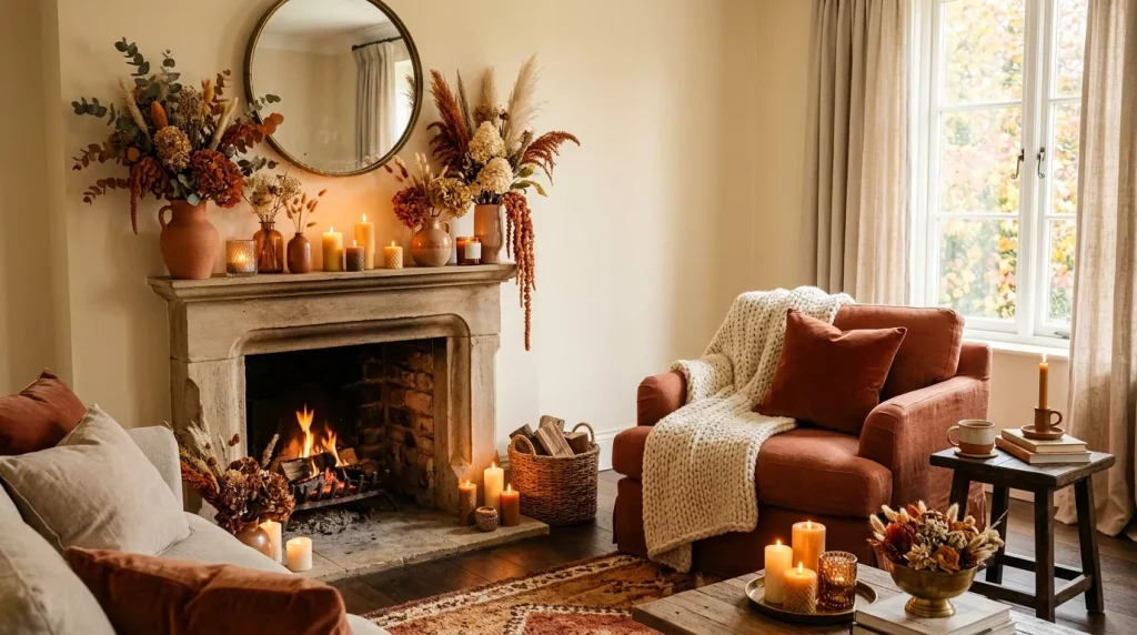
It also photographs beautifully, which is why you see it all over Pinterest and Instagram. But beyond aesthetics, it genuinely makes spaces feel more human and grounded.
Terracotta Home Decor Color Scheme Ideas for Every Room
Not every room calls for the same approach. Here’s how to tailor terracotta home decor color scheme ideas to different spaces in your home.
Living Room: Bold, Warm, and Inviting
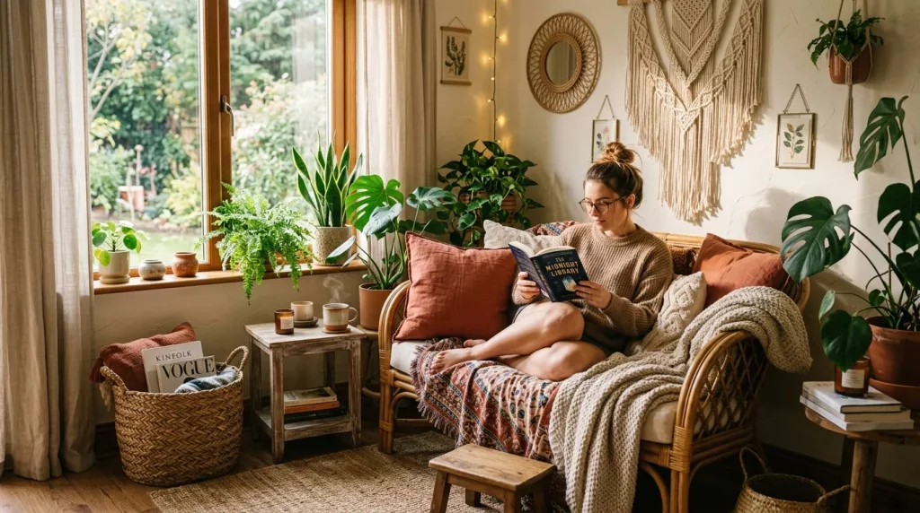
The living room is the perfect playground for terracotta. It’s a space built for comfort and conversation, and terracotta naturally supports both.
Popular living room combinations include:
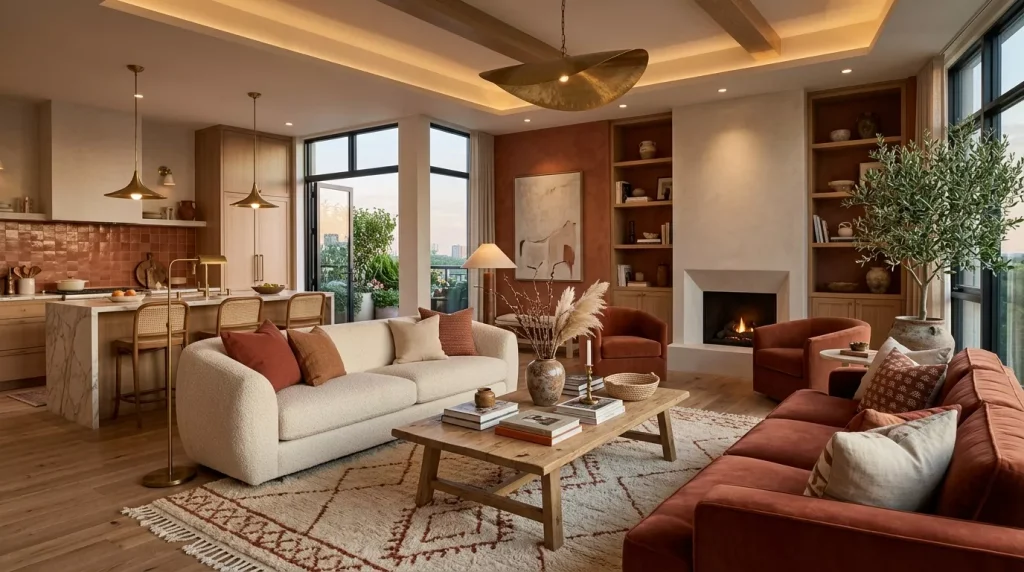
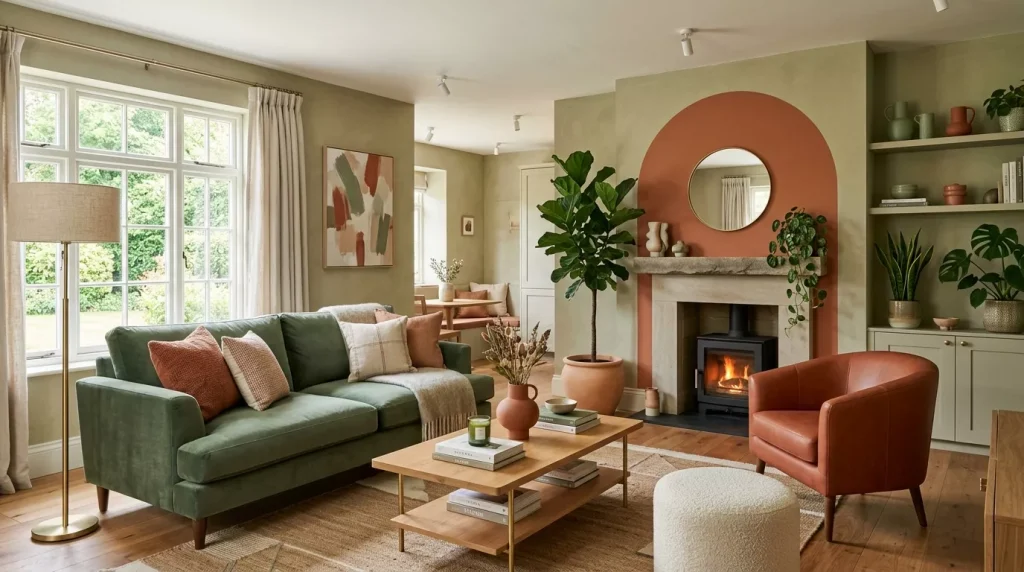
- Terracotta + Cream + Olive Green — Classic and earthy, this trio creates a boho-organic vibe without looking outdated.
- Terracotta + Deep Teal — A bold, complementary pairing that feels sophisticated and unexpected.
- Terracotta + Warm Sand + Rust — An all-warm palette that’s cozy without being overwhelming.
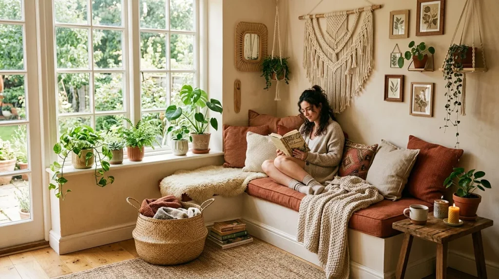
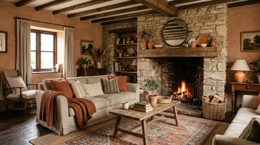
Try painting one accent wall in terracotta and keeping the remaining walls in warm off-white. Layer in terracotta through your throw pillows, area rugs, and ceramic vases. You get the depth without the weight.
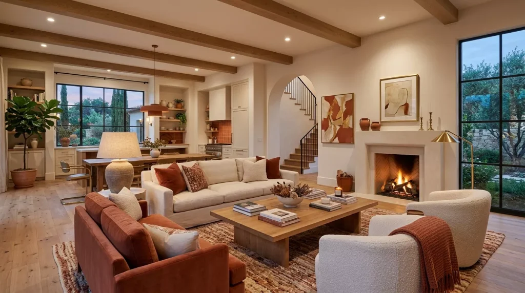
A burnt orange sofa or terracotta accent armchair can anchor the whole room and tie everything together effortlessly.
Bedroom: Cozy and Restorative
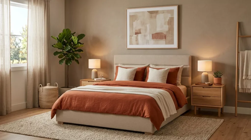
Terracotta in a bedroom feels like a warm hug at the end of the day. The key is to balance the intensity so it promotes rest rather than stimulation.
Best terracotta bedroom color schemes:
- Terracotta + Dusty Blush + Natural Linen — Soft, romantic, and serene. Great for a feminine or neutral aesthetic.
- Terracotta + Charcoal + Warm Wood — Grounded and masculine. Works well in Scandinavian or mid-century modern styles.
- Terracotta + Sage Green + White — A nature-inspired palette that’s incredibly calming.
Use terracotta on your headboard wall or through your bedding. Avoid overdoing it — two or three terracotta elements in a bedroom is usually plenty. Let the other tones breathe around it.
Kitchen and Dining Room: Appetite-Stimulating and Characterful
Terracotta has long been used in Mediterranean kitchens — think Tuscan farmhouses with terracotta tile floors and warm amber walls. There’s a reason for that. The color is warm and food-friendly, making meals feel more inviting.
Ideas for kitchens and dining rooms:
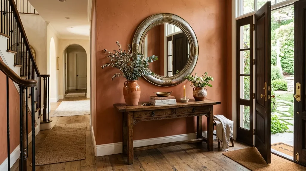
- Terracotta tiles + White subway tiles — A timeless contrast that works in both modern and rustic kitchens.
- Terracotta cabinet fronts + Brass hardware — Instantly luxurious and editorial.
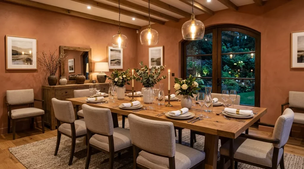
- Terracotta walls + Warm wood dining table + Woven pendant lights — A relaxed, earthy dining space that feels curated.
Even something as simple as terracotta-glazed ceramic dinnerware or a clay pot centerpiece can introduce the color without a full renovation.
Bathroom: Surprisingly Stunning
Terracotta in a bathroom might not be the first thing that comes to mind, but it’s one of the most impactful uses of the color.
Terracotta bathroom ideas:
- Terracotta zellige tiles + Raw concrete floors — Deeply textured and editorial.
- Terracotta walls + Dark grout + Matte black fixtures — Modern and bold.
- Terracotta towels + Neutral stone tiles — A low-commitment way to bring the color in.
Because bathrooms are typically smaller, even a single terracotta element — like a handmade clay soap dish or a warm rust-toned bath mat — can shift the whole mood of the space.
Best Color Combinations with Terracotta
One of the most valuable things to understand is which colors actually work alongside terracotta. Here’s a breakdown of the most versatile and popular pairings:
| Pairing Color | Mood It Creates | Best Room |
|---|---|---|
| Cream / Off-White | Warm, airy, balanced | Living room, bedroom |
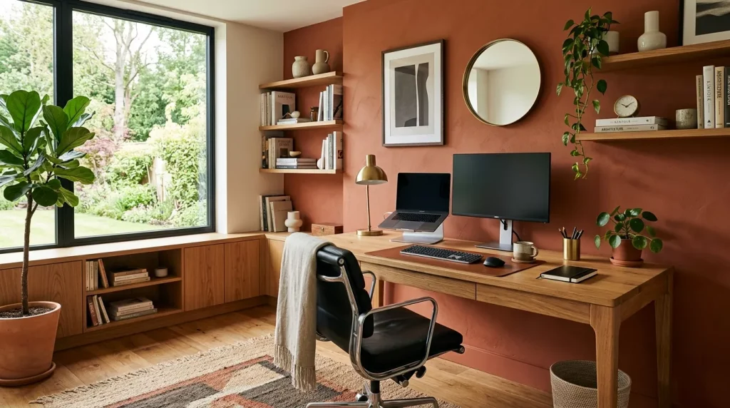
| Olive Green | Earthy, organic, boho | Living room, study |
| Deep Teal | Bold, complementary, moody | Living room, bedroom |
| Sage Green | Calm, natural, refreshing | Bedroom, bathroom |
| Dusty Blush | Soft, romantic, feminine | Bedroom, nursery |
| Warm Charcoal | Grounded, modern, dramatic | Bedroom, dining room |
| Brass / Gold | Luxurious, warm, editorial | Kitchen, bathroom |
| Natural Wood Tones | Rustic, cozy, timeless | Any room |
| Navy Blue | Rich, classic, high contrast | Dining room, living room |
| White | Clean, crisp, lets terracotta stand out | Any room |
The most important rule? Avoid pairing terracotta with cool, stark tones like icy blue or pure white without warm undertones. That creates a jarring contrast that makes the terracotta look cheap rather than intentional.
Terracotta vs. Other Warm Earth Tones: A Quick Comparison
People often confuse terracotta with similar shades. Here’s how it differs from its closest cousins:
| Color | Undertone | Feeling | Best Use |
|---|---|---|---|
| Terracotta | Red-orange, clay | Warm, grounded, lived-in | Walls, textiles, ceramics |
| Rust | Darker, more red | Moody, rich, dramatic | Accents, upholstery |
| Burnt Orange | Brighter, more orange | Energetic, bold | Statement pieces |
| Sienna | Brownish, earthy | Neutral, softer | Bedrooms, backgrounds |
| Paprika | Deeply saturated red | Intense, spicy | Feature walls only |
Terracotta sits in the sweet spot — it has enough warmth and character to be interesting, but it’s balanced enough to work as a primary or secondary color in most rooms.
Pros and Cons of Using Terracotta in Home Decor
Like any strong design choice, terracotta comes with genuine advantages and a few things to watch out for.
✅ Pros
- Timeless appeal — It never really goes out of style because it’s rooted in natural materials.
- Highly versatile — Works in bohemian, Mediterranean, modern, rustic, and even contemporary styles.
- Warmth without being heavy — Adds coziness without making a space feel dark or closed off.
- Pairs beautifully with nature-inspired textures — Rattan, jute, linen, raw wood, and ceramics all look incredible with it.
- Easy to layer — You can go light (one terracotta throw pillow) or bold (a full terracotta accent wall) depending on your comfort level.
- Photogenic — Creates gorgeous, warm lighting in photos, which matters if you care about how your space looks on camera.
❌ Cons
- Can feel overwhelming in excess — Too much terracotta without visual breaks can make a room feel stuffy.
- Clashes with cool-toned decor — If your furniture leans gray, silver, or cool white, terracotta may create an awkward tension.
- Not ideal for north-facing rooms — Rooms with little natural light can look flat or muddy with heavy terracotta use.
- Tricky to repaint — Terracotta’s strong pigment often requires extra primer coats when you’re ready to change colors.
Step-by-Step Guide: Building Your Terracotta Color Scheme from Scratch
Not sure where to start? Follow these steps and you’ll have a cohesive scheme in no time.
Step 1: Choose Your Role for Terracotta Decide if terracotta will be your dominant color (walls, large furniture), your secondary color (accents, textiles), or just a pop of interest (small decor pieces). This decision shapes everything else.
Step 2: Find Your Anchor Neutral Terracotta needs a companion neutral to balance it. Cream, warm white, warm gray, or natural linen all work well. Choose one and use it consistently.
Step 3: Add One Contrasting or Complementing Color Pull in a second accent color. Sage green, teal, navy, or olive green are all excellent choices. Limit yourself to one — too many colors will fragment the palette.
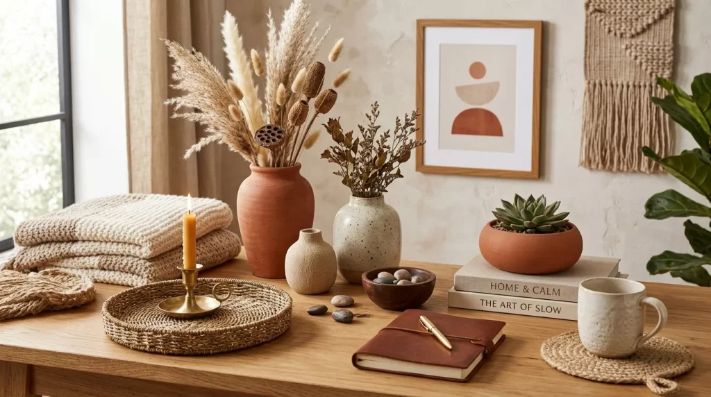
Step 4: Bring in Texture Terracotta loves texture. Think woven baskets, ceramic vessels, linen curtains, jute rugs, and raw wood furniture. These elements enrich the palette and prevent it from looking flat.
Step 5: Test Before You Commit If you’re considering terracotta walls, buy a small pot of paint and test it in your actual room at different times of day. Terracotta looks very different under warm evening light versus cold morning light.
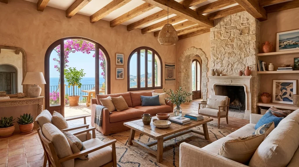
Step 6: Layer Gradually Start with small pieces — cushions, a throw, a clay vase — before investing in larger items like furniture or paint. This lets you feel the effect before you’re fully committed.
Common Mistakes to Avoid with Terracotta Decor
Even the most beautiful color can go wrong if you’re not careful. Here are the most frequent missteps people make with terracotta.
❌ Going all-terracotta without breaks Covering every surface in terracotta reads as chaotic rather than cohesive. Always include breathing room with neutrals.
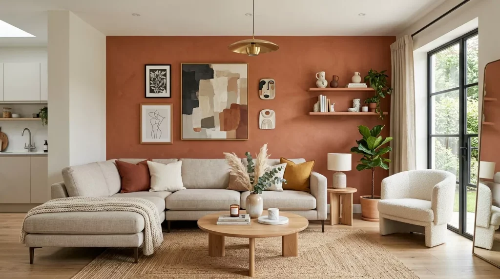
❌ Mixing too many warm tones of similar value Pairing terracotta with rust, burnt orange, AND paprika creates a muddy, indistinct palette. Choose one warm accent and let the others go.
❌ Using cool-toned whites with terracotta Blue-white or gray-white walls next to terracotta look mismatched. Use warm whites with yellow or cream undertones instead.
❌ Ignoring the undertone of your existing furniture If your sofa is cool gray and your floors are pale ash wood, terracotta will fight your existing pieces. Check undertones before you buy.
❌ Skipping texture A terracotta color scheme without textural variation looks flat and one-dimensional. Layers of texture are what make earthy palettes sing.
❌ Forcing terracotta into a modern or industrial space Terracotta leans warm and organic. Ultra-modern or industrial spaces often have a cool, sleek quality that clashes with it. Consider using it only as a subtle pop in those contexts.
Pro Tips for Working with Terracotta in Your Home
These practical tips will help you get the most out of your terracotta color scheme.
- Use natural light as your guide. South-facing rooms with warm natural light are best for terracotta walls. In darker rooms, keep terracotta to smaller accents.
- Mix clay and matte finishes. Glossy terracotta can look garish. Stick to matte, satin, or eggshell finishes for a more organic, authentic feel.
- Layer different terracotta shades. Using a light terracotta cushion alongside a deeper terracotta vase and a dusty terracotta throw creates a rich, dimensional look.
- Let plants do some work. Greenery is terracotta’s best friend. A trailing pothos or a cluster of terracotta pots with succulents enhances the earthy palette effortlessly.
- Think beyond paint. Terracotta doesn’t have to mean paint. Tiles, textiles, ceramics, wallpaper, and even woven rugs carry the color beautifully — sometimes better than paint.
- Balance warm colors with cool metal accents. Brushed brass and warm gold both amplify terracotta beautifully, but a touch of matte black or cool silver can keep the palette from feeling too sweet.
Conclusion: Make Terracotta Work for You
Terracotta home decor color scheme ideas are endlessly adaptable — which is exactly what makes them so appealing. Whether you’re fully committing with an accent wall and matching ceramics or just testing the waters with a terracotta throw pillow, this color has a remarkable ability to transform a space from ordinary to genuinely warm and beautiful.
The key is intention. Choose your approach, pick your palette partners carefully, and layer in texture to give the color depth. Avoid the common pitfalls, test before you commit, and don’t be afraid to start small.
Terracotta isn’t just a color — it’s a feeling. And once you bring that feeling into your home, it’s hard to imagine living without it.
Ready to transform your space? Start with one small terracotta element this week — a ceramic vase, a throw pillow, or even a clay candle holder. See how it feels. Chances are, you’ll be ready for more.
FAQs: Terracotta Home Decor Color Scheme Ideas
Q1: Is terracotta a warm or cool color?
Terracotta is definitively a warm color. It sits within the warm spectrum of the color wheel, close to burnt orange and rust. Its warmth comes from its red and orange undertones, which is why it pairs best with other warm tones like cream, olive green, and warm wood. Placing it next to cool colors — like icy blue or cool gray — creates a jarring contrast, so it’s important to consider the temperature of your existing decor before introducing terracotta.
Q2: What colors go best with terracotta?
Terracotta is incredibly versatile and works with a wide range of colors. Its best pairings include warm cream, off-white, olive green, sage green, deep teal, dusty blush, charcoal, navy blue, and natural wood tones. Brass and warm gold accents elevate it further. The general rule is to keep the palette warm and earthy for a cohesive look, using cooler tones only as deliberate contrasts rather than the dominant companions.
Q3: Can I use terracotta in a small room without making it feel cramped?
Yes, absolutely. The trick is proportion and placement. In small rooms, avoid terracotta on all four walls. Instead, use it on a single accent wall or bring it in through textiles, ceramics, and smaller decor pieces. Pairing terracotta with a light, warm white on the other walls keeps the space open and airy while still delivering the warmth and character terracotta is known for. Matte finishes also help by reducing visual heaviness.
Q4: Is terracotta still trendy in 2025–2026, or is it fading out?
Terracotta has long surpassed “trendy” and entered the territory of a design classic — much like navy blue or sage green. While it peaked in mainstream popularity around 2021–2023, its usage has actually matured and deepened since then. Designers are now incorporating it in more sophisticated, layered ways rather than the Pinterest-saturated simplicity of its early trend days. Its timeless connection to natural materials and warmth means it isn’t going anywhere soon.
Q5: How do I introduce terracotta into my home without repainting or renovating?
You don’t need paint or a renovation to work terracotta into your home. The easiest entry points are soft furnishings — throw pillows, blankets, and bed linen are the most affordable ways to test the color. After that, look to terracotta ceramic vases, clay planters, woven baskets in rust tones, and terracotta-glazed dinnerware. Even a terracotta-toned area rug can shift the mood of an entire room without touching a single wall.
Q6: Does terracotta work with a modern or minimalist interior style?
Terracotta can work in modern or minimalist spaces, but it needs a lighter touch in those contexts. Use it as a single, intentional pop of color rather than as a dominant tone. A single terracotta sculptural vase on a clean white shelf or terracotta-toned linen curtains in a mostly neutral room can add warmth without disrupting the clean aesthetic. The key in minimalist spaces is restraint — one or two well-chosen terracotta pieces, rather than a full palette application.
Q7: What flooring works best with a terracotta color scheme?
Warm wood floors — especially medium and golden oak tones — are the most natural match for terracotta walls and decor. Concrete floors in a warm beige or gray also work beautifully in a more industrial-earthy application. Actual terracotta or saltillo tile floors are stunning when paired with white or cream walls to avoid overpowering warmth. What to avoid: cool-toned gray laminate or very pale ash wood, which can create tension with terracotta’s warm, rich hue.