Bold & Colorful Home Decor Ideas to Try in 2026

Bold & Colorful Home Decor Ideas to Try in 2026
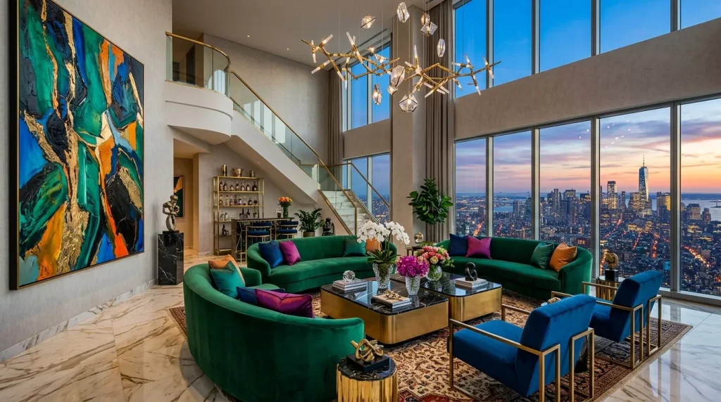
If your living room still looks like a dentist’s waiting room, it might be time for a change. Bold & colorful home decor ideas are taking over interior design right now, and for good reason — they turn a flat, forgettable space into something that actually feels like you. Gone are the days when every wall had to be greige and every sofa had to be beige. People are craving rooms with personality, warmth, and a little bit of drama.
This guide walks you through everything you need to know about using color and pattern confidently in your home, even if you’ve never picked up a paint roller in your life.
Why Bold and Colorful Decor Is Having a Moment
For the last decade, minimalism ruled. Clean lines, white walls, and “less is more” were the mantra in nearly every home renovation show.
But minimalism can feel cold after a while. Many homeowners say their all-neutral spaces look nice in photos but feel lifeless to actually live in.
Bold decor flips that script. It brings energy into a room without sacrificing comfort or function. A few reasons this trend isn’t going anywhere:

- Color affects mood. Warm tones like terracotta and mustard create coziness, while cool jewel tones like emerald and sapphire feel rich and grounding.
- It’s a form of self-expression. Your home should reflect your personality, not a showroom catalog.
- Social media has shifted taste. Maximalist interiors photograph beautifully and have pushed bold, layered rooms back into the spotlight.
- It works in small and large spaces alike. Contrary to popular belief, color doesn’t shrink a room — used correctly, it can actually make a small space feel more intentional.
Once you understand the psychology behind color, decorating with confidence becomes a lot less intimidating.
How to Choose a Bold Color Palette (Step-by-Step)
Picking colors can feel overwhelming when there are thousands of paint chips staring back at you. Here’s a simple process to narrow things down.
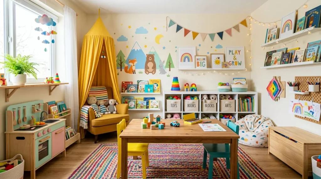
Step 1: Start With One Inspiration Piece
Pick something you already love — a rug, a painting, a vintage chair, even a piece of fabric. Pull three or four colors directly from it.
Step 2: Pick a Dominant, Secondary, and Accent Color
A balanced bold room usually follows a simple ratio:
- 60% dominant color – walls or large furniture
- 30% secondary color – curtains, an area rug, or an accent chair
- 10% accent color – throw pillows, art, vases, or small decor objects
Step 3: Test Before You Commit
Paint large swatches directly on your wall and observe them at different times of day. Lighting changes everything, especially with saturated tones.
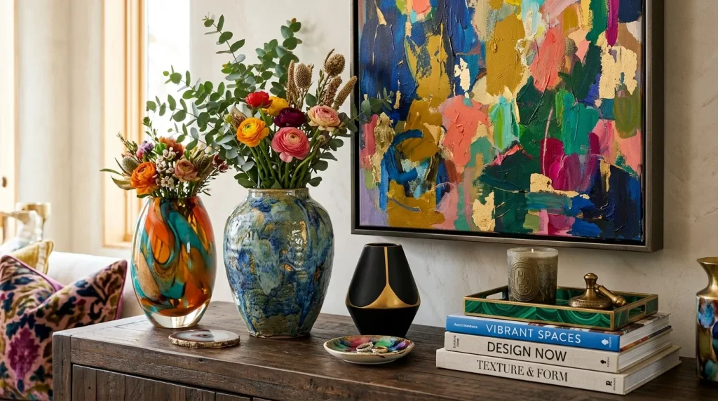
Step 4: Anchor Bold Colors With a Neutral Base
Even the boldest rooms need breathing room. Keep large surfaces like flooring or ceilings neutral so the color doesn’t overwhelm the eye.
Step 5: Layer in Texture
Color alone isn’t enough. Mixing textures — velvet, woven jute, brushed brass — keeps a colorful room from feeling flat or one-dimensional.
Room-by-Room Bold Decor Ideas
Different rooms call for different approaches. Here’s how to apply bold, colorful design in each major space of your home.
Living Room
This is usually where people start, since it’s the room guests see first.

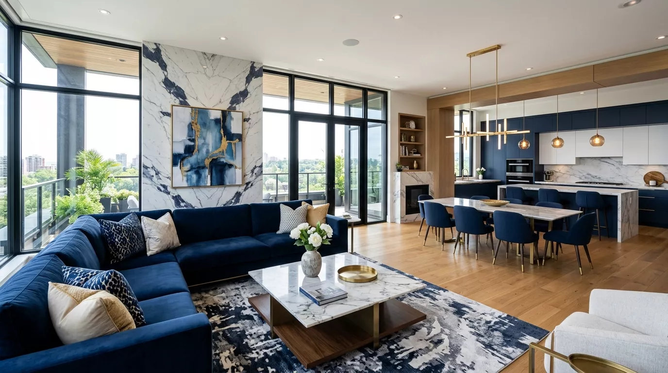
- Paint one wall in a deep jewel tone like forest green or navy as an accent wall.
- Pair a neutral sofa with a brightly patterned area rug to ground the space.
- Add an oversized piece of abstract art with a strong color palette as a focal point.
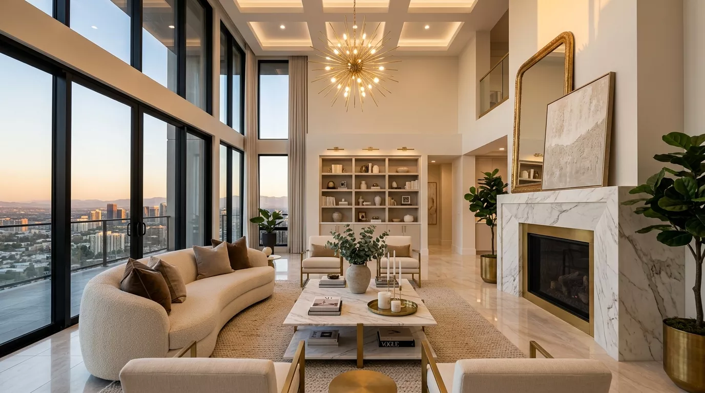
- Mix in metallic accents (brass lamps, gold-framed mirrors) to make colors pop further.
Bedroom
Bold doesn’t have to mean energetic — it can also mean cozy and enveloping.
- Try a moody, saturated wall color like plum or rust for a cocoon-like feel.
- Layer different patterned textiles: a striped duvet, a floral throw, a solid-color bed skirt.
- Use warm-toned lighting to soften bold colors at night.
Kitchen
Kitchens are a great place to experiment since cabinetry and tile offer built-in structure.
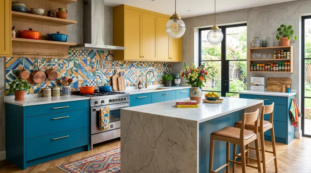
- Choose colorful lower cabinets paired with white or light upper cabinets.
- Add a bold tile backsplash in a geometric or Moroccan-inspired pattern.
- Bring in color through small appliances, bar stools, or open shelving styled with colorful dishware.
Bathroom
Small rooms are perfect for big personality since there’s less surface area to commit to.
- Use a saturated wall color combined with patterned tile flooring.
- Add colorful towels, a printed shower curtain, or a statement vanity mirror.
- Consider a bold-colored vanity cabinet instead of the usual white or wood tone.
Home Office

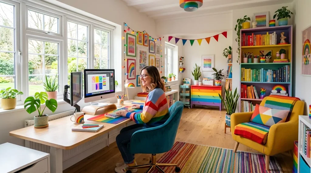
A colorful workspace can actually boost focus and creativity rather than distract from it.
- Choose an energizing color like coral, teal, or mustard for one accent wall.
- Add a patterned rug under the desk to define the space.
- Use colorful storage bins or shelving to keep the room functional, not chaotic.
Bold Patterns and Textures That Work Well Together
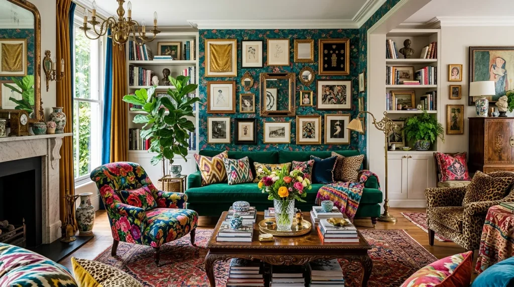
Color is only half the story — pattern and texture are what give a room depth. Mixing patterns intimidates a lot of beginners, but there’s a simple trick: vary the scale.
| Pattern Type | Best Used For | Pairs Well With |
|---|---|---|
| Large florals | Curtains, accent chairs | Small geometric prints |
| Stripes | Rugs, throw pillows | Solid bold colors |
| Geometric tile | Bathroom or kitchen floors | Plain-colored walls |
| Animal print | Accent pieces only | Neutral furniture |
| Ikat or block print | Bedding, upholstery | Solid jewel tones |
A good rule of thumb: combine a large-scale pattern with a small-scale one, and always include at least one solid color to let the eye rest.
Best Bold Color Combinations to Try
If you’re staring at a color wheel and feeling stuck, these tried-and-true pairings are a great place to start. They’ve been used in countless interiors because they simply work together.
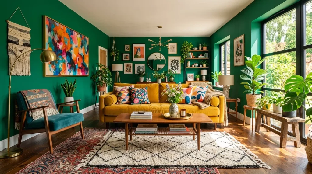
- Emerald green + brass + cream — feels rich and timeless, great for living rooms or dining areas.
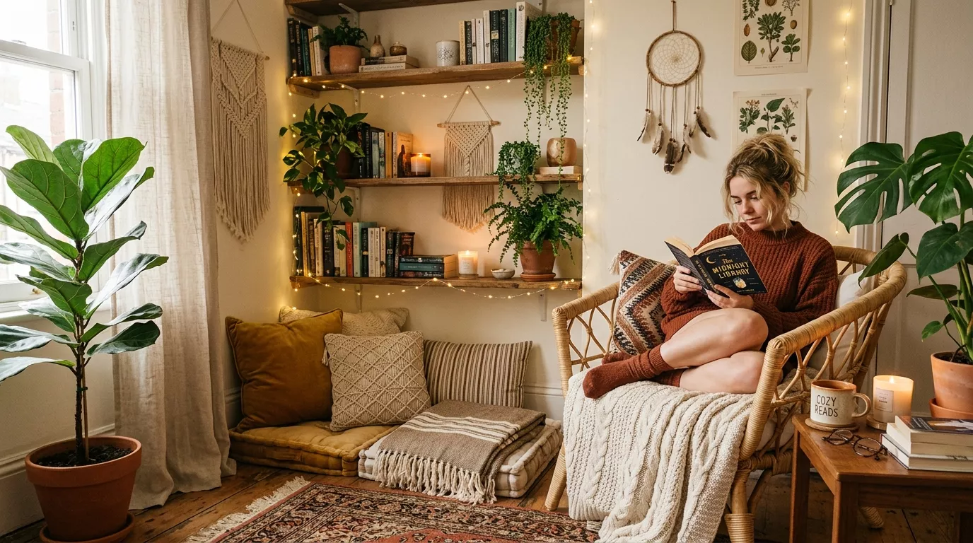
- Terracotta + navy + warm white — a cozy, earthy combination that suits bedrooms and reading nooks.
- Mustard yellow + charcoal + blush pink — playful but grounded, ideal for a home office or kitchen.
- Burgundy + forest green + gold — a moody, sophisticated pairing that works beautifully in formal living rooms.
- Coral + teal + sandy beige — bright and beachy, perfect for sunrooms or kids’ spaces.
- Cobalt blue + white + natural wood tones — crisp and modern, great for kitchens or bathrooms.
You don’t need to use all three colors in equal amounts. Let one lead, one support, and one act as the finishing accent, just like the 60-30-10 rule mentioned earlier.
It also helps to think about the season and natural light your room gets. North-facing rooms tend to get cooler light, so warmer color combinations often feel more balanced. South-facing rooms get warmer light throughout the day, which means cooler tones like blues and greens often read as more vibrant rather than washed out.
Bold & Colorful Decor vs. Neutral Minimalist Decor
Trying to decide which style direction is right for you? Here’s a side-by-side comparison.
| Factor | Bold & Colorful Decor | Neutral Minimalist Decor |
|---|---|---|
| Mood created | Energetic, warm, personal | Calm, airy, restrained |
| Best for | People who love personality and change | People who prefer simplicity |
| Resale impact | Can be polarizing for some buyers | Generally appeals to a wider audience |
| Maintenance | Requires thoughtful styling | Easier to keep looking “finished” |
| Cost to update | Can be done in small budget bursts | Often requires fewer, pricier pieces |
| Flexibility | Easy to swap accents over time | Harder to change without redoing the whole look |
Neither approach is “better” — it really comes down to lifestyle and personal taste. Plenty of homeowners actually blend both, using a neutral shell with bold accents layered on top.

Pros and Cons of Bold & Colorful Home Decor
Before you commit to a full color overhaul, it helps to weigh the upsides against the potential downsides.
Pros:
- Adds personality and warmth that neutral spaces often lack
- Makes a home feel more memorable and lived-in
- Easy to update seasonally with smaller, affordable accents
- Can highlight architectural features like moldings or built-ins
- Works in nearly any budget, from a $10 throw pillow to a full repaint
Cons:
- Bold colors can feel overwhelming if not balanced properly
- Trends shift, so very saturated choices may date a space faster
- Some buyers prefer neutral interiors, which can matter for resale
- Mixing patterns and colors takes more planning than an all-white room
- Mistakes (like clashing undertones) are more visible than with neutrals
Tips for Decorating With Bold Colors
A few small habits make a huge difference in how polished a colorful room ends up looking.
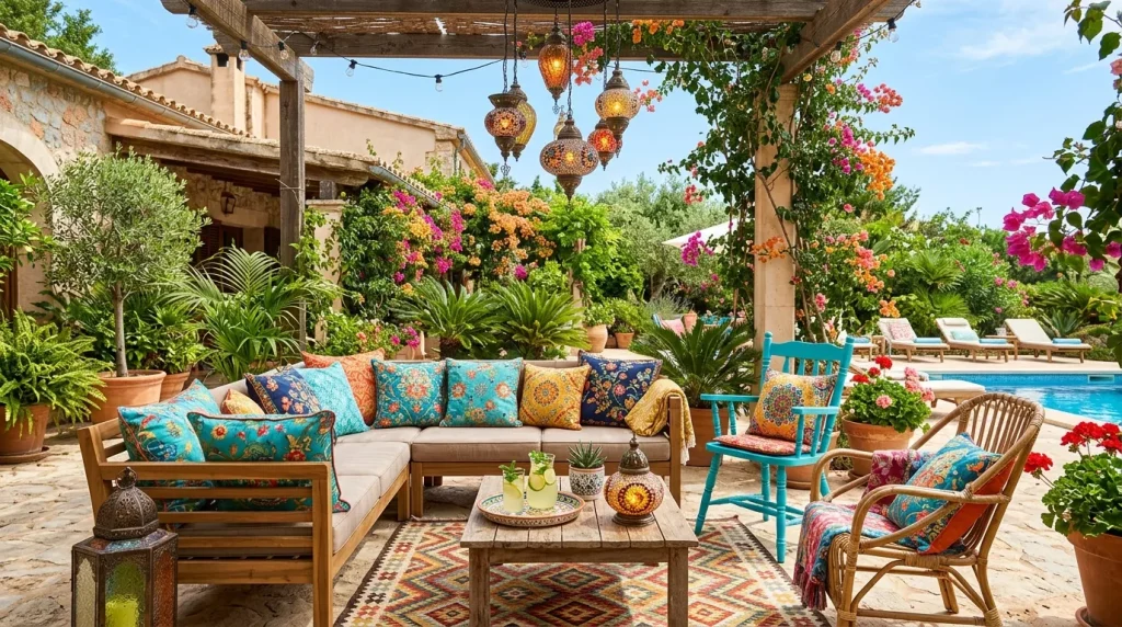
- Stick to a 3-4 color palette per room so things don’t feel chaotic.
- Use the color wheel — complementary colors (opposite each other) create energy, while analogous colors (next to each other) feel more soothing.
- Don’t forget the ceiling. A “fifth wall” painted in color or a soft tint can make a room feel finished.
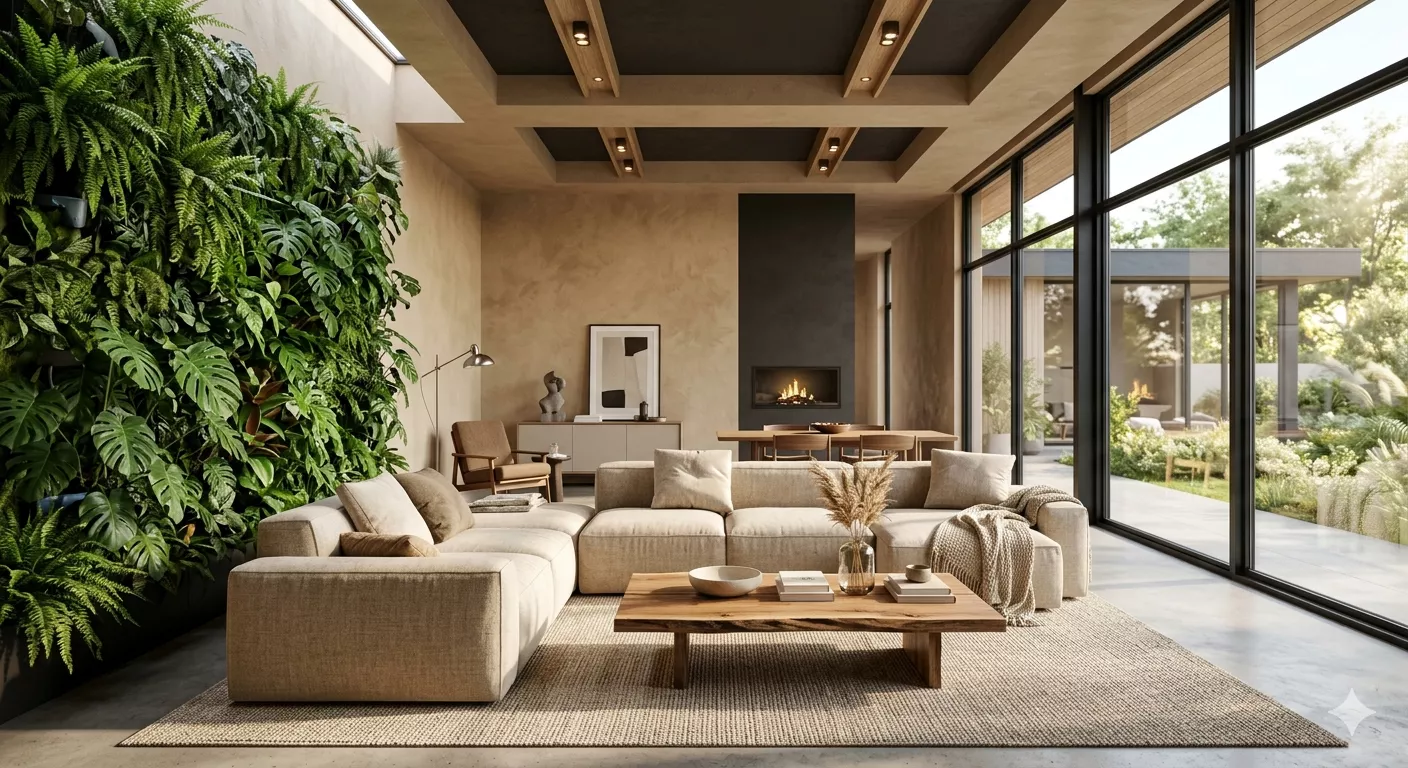
- Bring in greenery. Plants soften bold color schemes and add a natural, organic balance.
- Repeat your accent color at least three times in a room — once is an accident, three times looks intentional.
- Photograph your space in natural light before finalizing big purchases like sofas or rugs, since colors can shift dramatically indoors.
Common Mistakes to Avoid
Even experienced decorators slip up sometimes. Watch out for these common pitfalls.

- Going too bold, too fast. Painting every wall in a different saturated color at once usually backfires. Start with one room or one wall.
- Ignoring undertones. A “warm red” and a “cool red” can clash badly even though they’re technically the same color family.
- Skipping the neutral anchor. Without at least one neutral surface (floor, ceiling, or large furniture piece), bold rooms can feel exhausting to be in.
- Matching instead of coordinating. Perfectly matching every item (like an all-orange room) often looks flatter than colors that complement rather than match exactly.
- Forgetting about lighting. Bold colors look completely different under warm bulbs versus daylight bulbs versus natural window light. Test before committing.
- Overcrowding with patterns. Too many competing prints in one space can feel busy rather than curated. Leave visual breathing room with solid-colored furniture or walls.
Final Thoughts
Bold & colorful home decor ideas aren’t just a passing trend — they’re a return to homes that feel personal, warm, and full of character. You don’t need a massive budget or a design degree to pull it off. Start small with one accent wall, a patterned rug, or a few statement pillows, and build confidence from there.
The most important thing to remember is balance: pair bold choices with neutral anchors, repeat your accent colors intentionally, and don’t be afraid to experiment. Your home should feel like you, not a showroom.
Ready to bring more color into your space? Pick one room this weekend, choose a single bold accent, and see how it transforms the way the space feels. Small changes add up faster than you’d expect.
Frequently Asked Questions
1. Will bold colors make my home harder to sell later?
It can be a factor for some buyers, but it’s rarely a dealbreaker. Sticking to removable elements like rugs, art, and furniture (instead of permanent tile or built-ins) keeps your options open if you ever decide to sell.
2. How do I mix bold colors without it looking messy?
Follow the 60-30-10 rule: one dominant color, one secondary color, and one accent color. Anchoring the space with a neutral floor or ceiling also helps keep things from feeling cluttered.
3. What’s the easiest way to start if I’m nervous about commitment?
Begin with low-commitment items like throw pillows, a colorful rug, or removable wallpaper on a single accent wall. These are easy to change later if your taste shifts.
4. Do bold colors work in small rooms, or only large ones?
They actually work great in small rooms. A fully saturated small space (like a powder room or reading nook) can feel cozy and intentional rather than cramped, since there’s less “competing” surface area.
5. How many colors should I use in one room?
Most designers recommend sticking to three to four main colors per room, including your neutral base. This keeps the space feeling cohesive instead of chaotic.
6. What colors pair well with bold jewel tones like emerald or sapphire?
Warm metallics like brass and gold tend to balance jewel tones beautifully. Soft neutrals like cream or warm white also help keep the look grounded rather than overwhelming.
7. How do I know if a color will clash with my existing furniture?
Bring a fabric swatch or paint chip home and hold it next to your furniture in daylight. Pay attention to undertones — warm pieces generally pair better with warm colors, and cool pieces with cool colors.