Two Tone Kitchen Cabinet Ideas: Fresh Inspiration

Two Tone Kitchen Cabinet Ideas: Fresh Inspiration
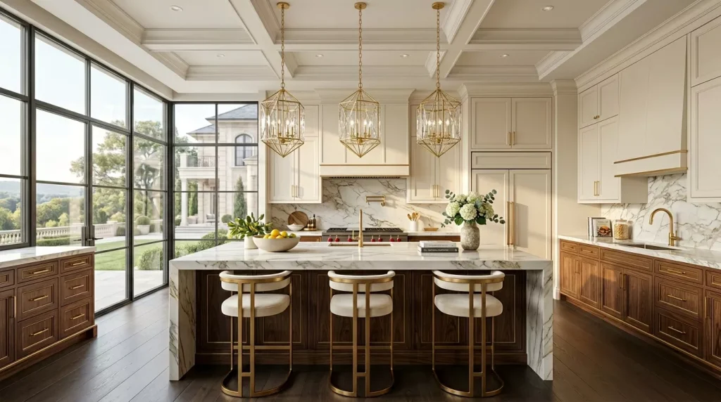
If you’ve been staring at your kitchen wondering why it looks a little… flat — two tone kitchen cabinet ideas might be exactly what you need. This approach has completely changed how designers and homeowners think about kitchen cabinetry, and honestly, it’s not hard to understand why.
Instead of committing every cabinet in your kitchen to one color, you use two. Simple in theory, stunning in practice. The visual contrast adds depth, personality, and a sense of intention that a single-color scheme just can’t deliver. And the best part? It works in nearly every kitchen style and size.
This guide covers everything you need to know — from the best color combinations to the most common mistakes, and a practical step-by-step planning process you can actually follow.
Why Two Tone Kitchen Cabinets Are Worth the Attention

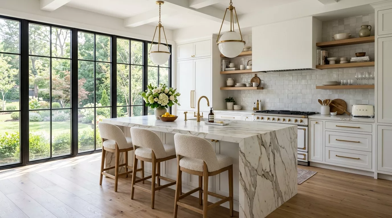
Walk into any kitchen showroom today and you’ll see it everywhere — lighter uppers, darker lowers, a contrasting island, or a painted accent cabinet that anchors the whole design. Two-toned cabinetry isn’t just a passing trend. It’s a practical design decision with real visual logic behind it.
The concept works because of the way our eyes move through a room. Using a darker tone on your lower cabinets and a lighter one up top mimics the natural visual weight we expect — darker on the ground, lighter toward the sky. It feels balanced even if you can’t quite put your finger on why.
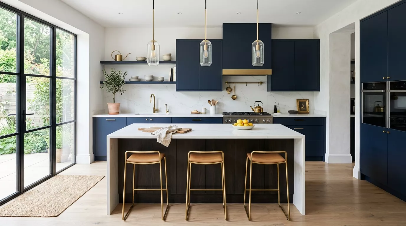
It also gives you a way to incorporate a bold color without going all-in. Love navy blue but worried it might be too much? Put it on your base cabinets and let your uppers breathe in white or cream. The navy gets its moment without overwhelming the space.
Beyond aesthetics, bi-color kitchens are genuinely practical for resale. A neutral upper paired with a color lower lets future buyers mentally “repaint” the bolder elements while still appreciating the overall design.]h
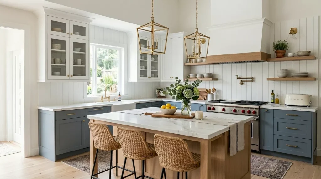
Best Two Tone Kitchen Cabinet Color Combinations
This is where most people spend the most time — and rightly so. The color pairing you choose sets the entire mood of your kitchen. Here are the combinations that consistently work.
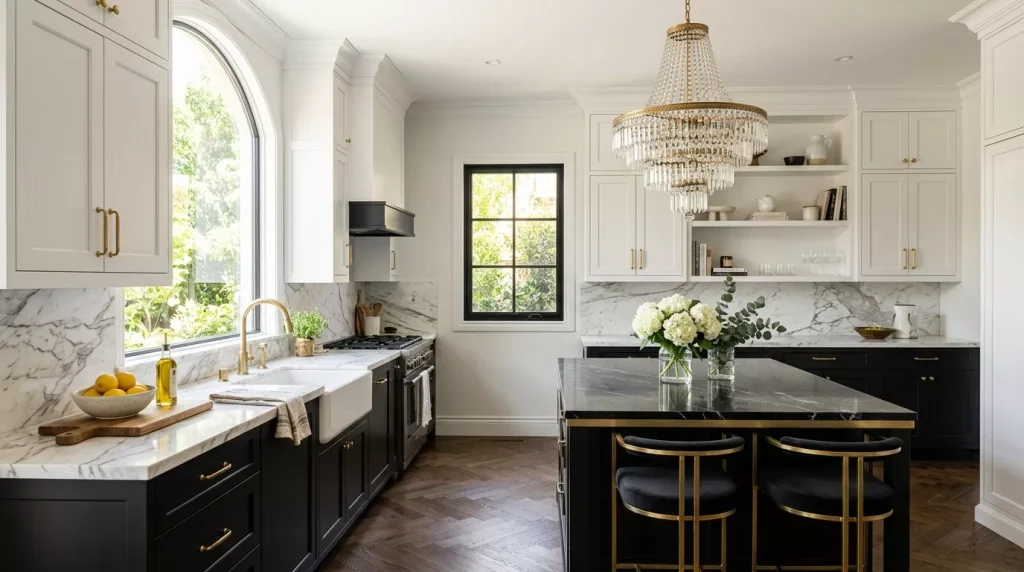
1. White Uppers with Dark Charcoal or Black Lowers
This is probably the most popular two-tone cabinet combination right now, and it earns its popularity. White upper cabinets keep the kitchen feeling airy and bright. Charcoal or matte black base cabinets add grounding contrast and a sense of sophistication.
It works across styles — from sleek modern kitchens to classic shaker-style designs. Pair with brass hardware and a marble-look countertop for maximum effect.
2. Navy Blue and Natural Wood
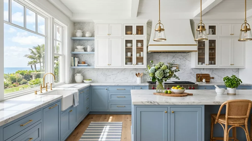
This pairing feels rich without being heavy. Deep navy on the base cabinets plays beautifully against warm timber upper cabinets or open shelving. It’s a kitchen combination that pulls you in immediately.
The key here is the wood tone. Lighter woods — oak, ash, maple — create a more contemporary feel. Darker walnut tones lean more traditional and moody. Either way, this pairing is a legitimate showstopper in the right hands.
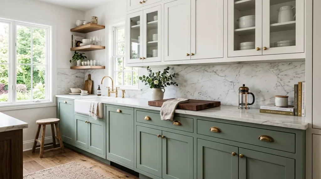
3. Sage Green and Warm Cream
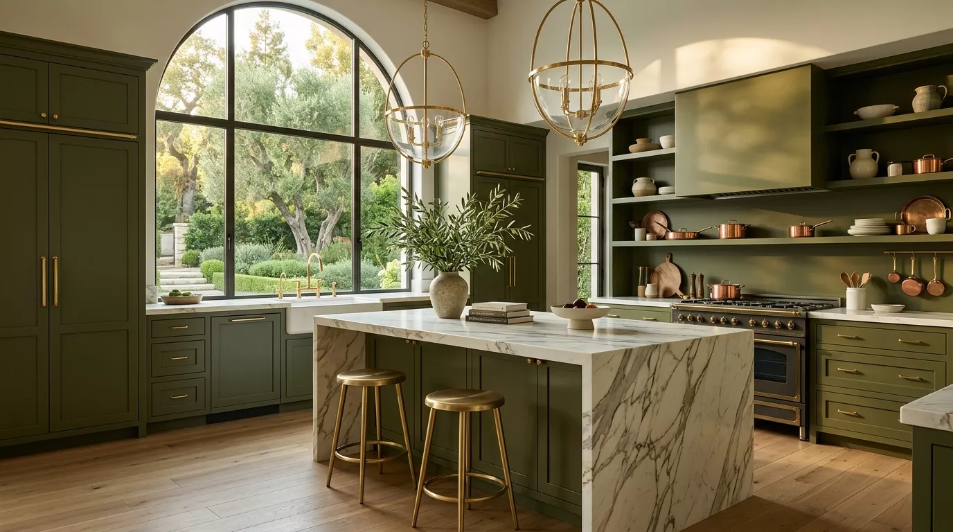
If your aesthetic runs more relaxed and organic, sage green base cabinets paired with warm cream or off-white uppers hit differently than a high-contrast scheme. It’s softer, more considered, and has that farmhouse-meets-European feel that’s been dominating kitchen design for the last few years.
Linen-textured paint finishes and aged brass hardware make this combination feel genuinely artisanal rather than trend-chasing.
4. Dusty Blue and White
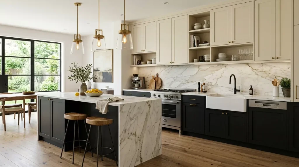
Similar in approach to navy but with a completely different energy. Dusty blue is gentler — it has a coastal, relaxed quality that makes kitchens feel effortless. Paired with bright or warm white uppers, it’s fresh without feeling clinical.
This works especially well in kitchens with good natural light. The blue catches the light and shifts throughout the day in a way that’s genuinely lovely to live with.
5. Warm Grey and Oak
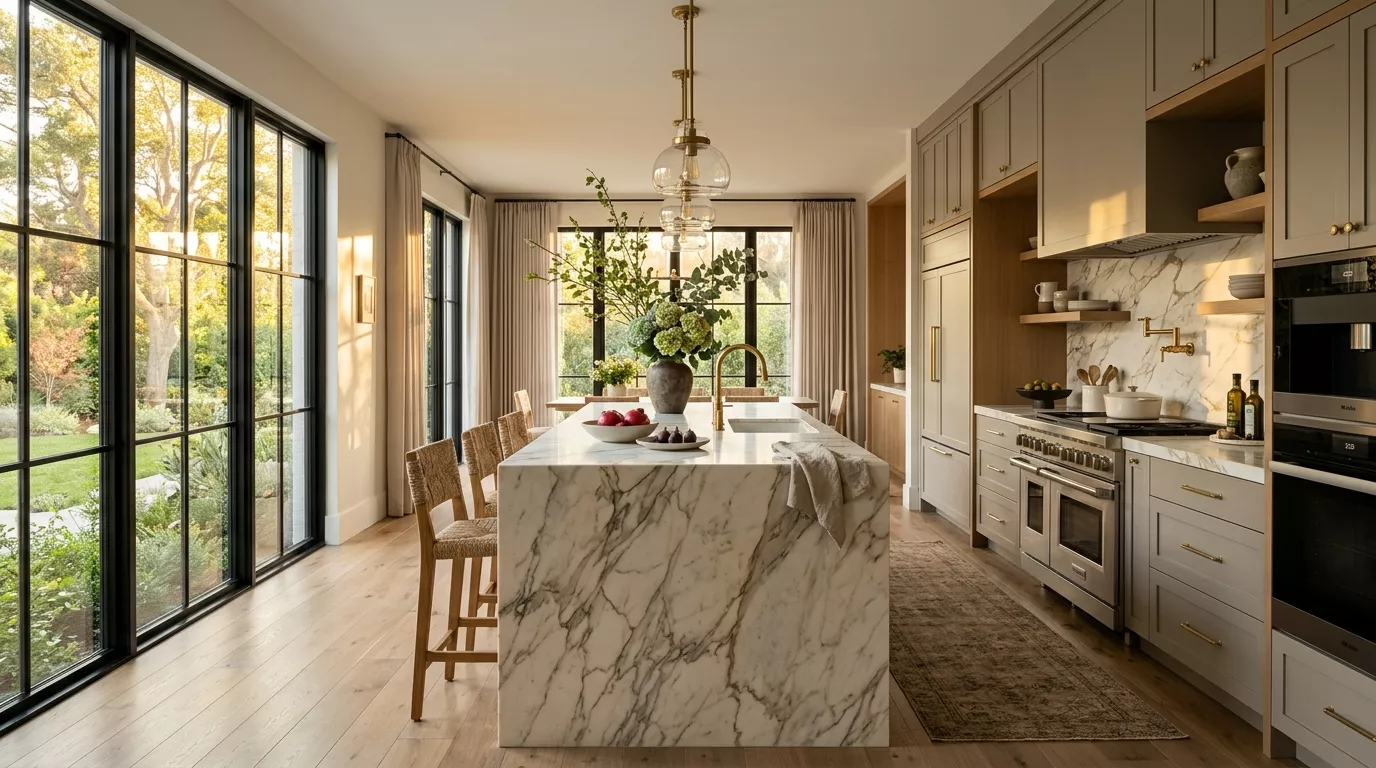
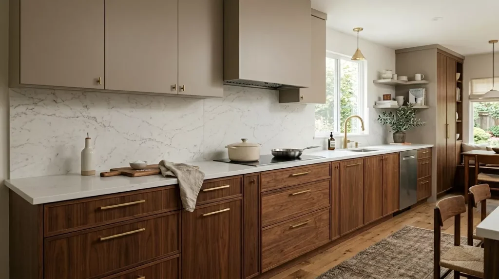
For something more subtle — understated rather than dramatic — warm grey base cabinets alongside natural oak uppers create a Japandi-adjacent feel that’s calm and cohesive. No hard edges, no strong contrast. Just two tones that feel like they belong together.
This is a strong choice if you’re nervous about committing to color but still want something more interesting than an all-white or all-grey kitchen.
Two Tone Kitchen Cabinet Ideas by Design Style
The color combination matters, but so does how it fits your overall kitchen aesthetic. Here’s how two-toned cabinetry translates across different styles.
Modern Farmhouse
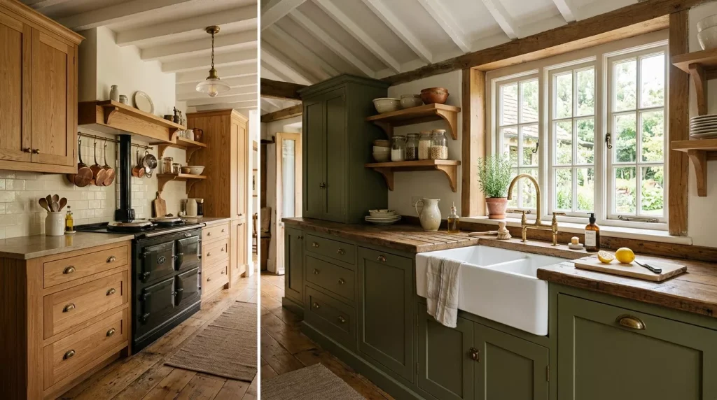
In a modern farmhouse kitchen, two-tone cabinets usually feature a shaker door profile, white or cream uppers, and a bolder color below — forest green, navy, or warm charcoal. Hardware in brushed bronze or matte black ties it together. Add open floating shelves between upper and lower cabinets for that classic farmhouse layering.
Contemporary or Minimalist
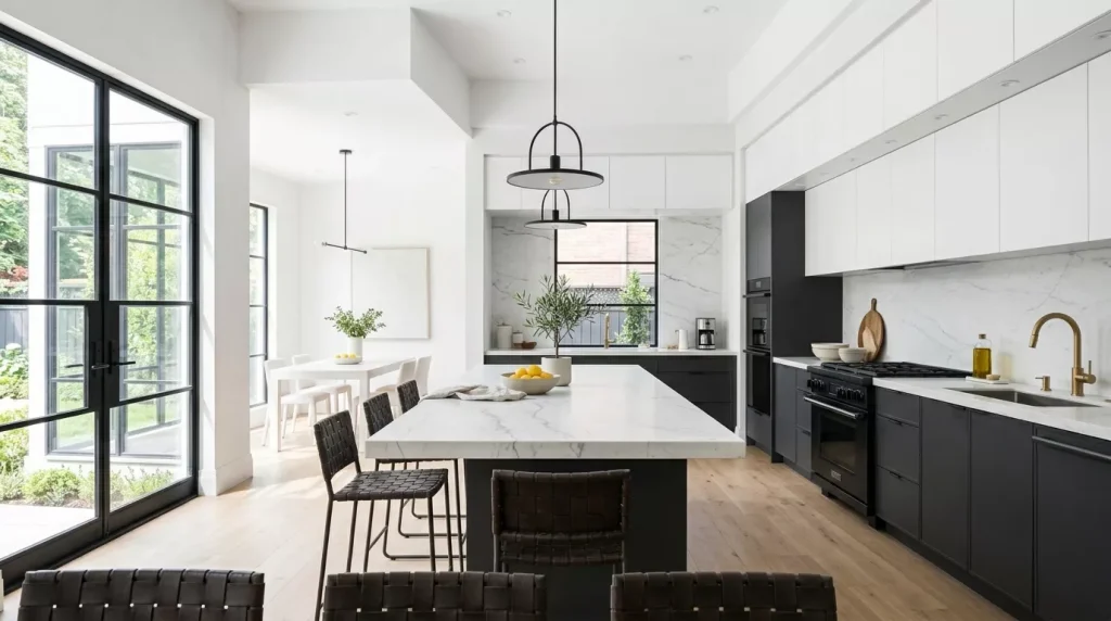
Contemporary kitchens usually keep two-tone combinations fairly restrained. Think flat-front cabinet doors, a crisp white upper against a concrete grey or deep charcoal lower, and minimal hardware (or none at all). The contrast here is about form and tone rather than decorative detail.
Traditional
In a traditional kitchen, two-toned cabinets work through color rather than format. Soft ivory uppers with a deep hunter green or navy blue on the base cabinets, both with classic raised-panel doors and polished chrome or antique brass hardware. The overall effect is timeless rather than trendy.
Coastal or Relaxed Beach Style
Coastal kitchens use two-tone schemes to reinforce that breezy, easy quality. Soft blue or seafoam lowers, white or linen uppers, with rattan pendant lights and natural wood elements. Nothing feels too deliberate — it all looks collected over time rather than designed in an afternoon.
Choosing the Right Cabinet Finish

The paint finish matters more than most people realize, especially in a kitchen where surfaces take a beating. Here’s what you need to know.
| Finish Type | Best For | Durability | Ease of Cleaning |
|---|---|---|---|
| Matte / Flat | Feature cabinets, lower traffic | Moderate | Harder — shows smudges |
| Eggshell | All-around cabinetry | Good | Easy |
| Satin | High-use cabinets, base units | Very Good | Very Easy |
| Semi-gloss | Traditional kitchens, high moisture | Excellent | Excellent |
| Lacquer | Contemporary, flat-front cabinets | Excellent | Excellent |
For most kitchens, satin or eggshell finishes hit the right balance between a sophisticated look and practical cleanability. Avoid flat/matte finishes on base cabinets unless you’re prepared to spot-clean regularly — kitchen base cabinets get touched constantly.
If you’re painting yourself rather than using factory-finished doors, make sure to use a primer specifically formulated for cabinetry and a kitchen-grade paint that resists moisture and grease.
Step-by-Step Guide to Planning Your Two Tone Kitchen
Planning a two-tone kitchen can feel overwhelming if you don’t have a structure to work through. Follow these steps and it becomes much more manageable.
Step 1: Decide Which Cabinets Get Which Color The most common approach is lighter uppers, darker lowers. But it’s not the only option. You could go with a contrasting kitchen island, a single accent cabinet run, or even just the pantry cabinet in a bolder tone. Know your approach before you pick colors.
Step 2: Choose Your Anchor Color First This is usually the bolder or darker of your two tones — the one that has more visual weight. Get this right first, then find a complementary secondary color that supports it rather than competing.
Step 3: Consider Your Countertops and Backsplash These surfaces interact with your cabinet colors constantly. If you have a warm beige granite countertop, a cool blue cabinet might clash. If your backsplash is already busy with pattern, keep your cabinet scheme simpler.
Step 4: Pull Physical Samples — Don’t Rely on Screens Paint looks different on a screen than in real life. Order physical swatches or sample pots and test them on your actual cabinet doors in your actual kitchen lighting before committing.
Step 5: Choose Your Hardware Hardware is the jewelry of your kitchen. Pick one metal finish and use it consistently across both cabinet tones. Mixing hardware finishes in an already two-tone kitchen risks visual chaos.
Step 6: Decide on a Transition Point Where exactly do your two tones meet? The countertop line is the most common transition point — upper cabinets one color, lower a different one. But if you have open shelving, a range hood, or other architectural features, these can also serve as natural transition zones.
Step 7: Get at Least Two Professional Quotes Whether you’re buying new cabinets or repainting existing ones, get multiple quotes. Two-tone kitchens can vary wildly in cost depending on the approach — factory finish vs painted-in-place, for example.
Pros and Cons of Two Tone Kitchen Cabinets
Before you commit, here’s an honest look at both sides.
Pros:
- Adds visual depth and dimension that single-color kitchens lack
- Lets you incorporate a bold color without overwhelming the space
- Works across a wide range of kitchen styles
- Can make a kitchen feel custom and intentional
- Gives the illusion of separate zones in open-plan spaces
- A smart approach for resale — bolder tones on lowers are easily repainted later
- Can refresh an existing kitchen without a full renovation

Cons:
- Harder to execute than a single-color scheme — color selection is more complex
- Can look chaotic if the two tones don’t work harmoniously
- More planning required upfront
- Hardware selection becomes more important (and potentially more expensive)
- Repainting later means maintaining consistency across two tones
- May date faster if you choose trendy color combinations over classic ones
Tips for Getting Two Tone Cabinets Right
These are the details that separate a two-tone kitchen that looks designed from one that looks like an accident.
- Use the 60/30/10 rule. Let one color dominate (60%), let the second tone take 30%, and use hardware and accessories as your 10% accent. This keeps the visual balance controlled.
- Warm tones pair with warm tones; cool with cool. Don’t mix a warm sage green with a cool slate grey — they’ll fight each other. Keep your palette in the same temperature family.
- Consider the flooring. Your kitchen floor is another color in the mix. Factor it in before finalizing your cabinet palette.
- Don’t skip the primer. Especially if painting existing cabinets. A proper bonding primer ensures your topcoat lasts and doesn’t chip or peel.
- Use the same sheen on both tones. Mixing a matte upper with a semi-gloss lower looks inconsistent and amateur. Keep the finish level consistent even when the color differs.
- Photograph the space in different lighting. Natural daylight, overhead artificial light, and evening lighting all affect how your cabinet colors read. Take photos at different times before committing.
Common Mistakes to Avoid
1. Choosing Two Colors That Are Too Similar If both tones are in the same value range — both mid-tone, both equally saturated — the contrast disappears and the whole point of going two-tone is lost. Make sure there’s enough difference in lightness or saturation between the two.
2. Ignoring the Kitchen Island If you have a kitchen island, it needs to be part of your two-tone strategy. A floating island in a third color can work, but it needs to be deliberate. An island that accidentally sits between your two tones and matches neither looks unfinished.
3. Mixing Too Many Finishes Two-tone cabinets already introduce visual complexity. Adding three different hardware finishes, a patterned countertop, a busy backsplash, and a bold floor tile is too much. When the cabinets are doing a lot of work, calm everything else down.
4. Going Too Trendy With the Bolder Color Ultra-trendy cabinet colors (think millennial pink or terracotta) can look tired within a few years. For a kitchen that’s going to last a decade, lean toward classic anchors — navy, forest green, deep charcoal — rather than whatever is dominating Pinterest this season.
5. Not Testing the Colors at Different Times of Day Morning light, afternoon light, and artificial evening light all change the way your cabinet colors appear. A color that looks beautiful in afternoon sun can look flat and dull under kitchen overhead lights. Always test before you commit.
6. Forgetting the Transition Element The point where your two tones meet needs some thought. A countertop, a shelf, or a design detail naturally creates a visual “break” between the colors. Without this, the two tones can feel like they’ve just been slapped next to each other.
Two Tone Kitchen Cabinet Comparison: Approaches at a Glance
| Approach | Visual Impact | Complexity | Best For |
|---|---|---|---|
| Light uppers, dark lowers | High | Low | Most kitchen styles |
| Contrasting island only | Medium | Low | Subtle differentiation |
| Single accent cabinet run | Medium | Low | Small kitchens, rental spaces |
| Wood upper, painted lower | High | Medium | Organic, Japandi-inspired kitchens |
| Two painted tones (same finish) | Very High | Medium-High | Bold, intentional statement kitchens |
| Upper color + lower natural wood | High | Medium | Warm, transitional style kitchens |
FAQs About Two Tone Kitchen Cabinet Ideas
Q1: Do two tone kitchen cabinets add value to a home?
Generally, yes — when done well. A thoughtfully executed two-tone kitchen signals quality and design intention to potential buyers. However, very bold or trend-specific color choices can divide opinion. If resale value is a priority, stick to timeless combinations like white uppers with navy or charcoal lowers rather than more niche color pairings.
Q2: Should upper or lower kitchen cabinets be darker?
The conventional approach is darker lowers, lighter uppers — and for good reason. It mimics natural visual weight distribution (heavier at the base, lighter overhead) and keeps the kitchen feeling open rather than top-heavy. That said, some designers intentionally break this rule for effect, using a moody upper and light lower for a dramatic ceiling draw. It can work, but it requires more confidence in execution.
Q3: How do I choose the right two cabinet colors?
Start with one anchor color — usually the bolder or more saturated of the two. Then find a supporting tone that complements it in temperature and energy rather than competing with it. Bring physical samples into your actual kitchen and observe them in your specific lighting conditions over at least 24-48 hours before deciding.
Q4: Can I paint my existing cabinets two different colors myself?
Yes, but it requires proper preparation. Remove cabinet doors, clean thoroughly, sand lightly, apply bonding primer, then your chosen paint in at least two thin coats. Use a kitchen-grade paint in satin or eggshell finish. The prep work is what determines the quality of the final result — rushing it leads to chipping, uneven coverage, and a finish that won’t last.
Q5: What hardware finish works best with two tone cabinets?
Brass and matte gold are the most versatile — they work equally well against warm and cool cabinet tones. Matte black is a strong choice for high-contrast schemes (white and charcoal, for example). Brushed nickel works best in cooler, more contemporary palettes. The key rule: pick one hardware finish and apply it consistently across both cabinet tones.
Q6: Are two tone kitchen cabinets a passing trend?
Two-tone cabinetry has actually been part of kitchen design for decades — it ebbs and flows in popularity but never completely disappears because the design logic behind it is sound. What trends more specifically are the color combinations within the two-tone approach. Stick to classic, timeless pairings and your kitchen will hold up long after current trends move on.
Q7: What’s the best two tone combination for a small kitchen?
In smaller kitchens, contrast works best when it creates the illusion of more space rather than drawing the eye inward. Light uppers (white, cream, or very pale grey) with a medium-toned lower (sage green, dusty blue, warm taupe) is a reliable formula. Avoid very dark lowers in small kitchens unless you have excellent lighting — they can make the lower half of the space feel cave-like.
Conclusion: It’s Time to Give Your Kitchen a Second Color
Two tone kitchen cabinet ideas are one of the smartest design moves you can make in a kitchen renovation or refresh. Done right, they add depth, visual interest, and a level of sophistication that single-color kitchens rarely achieve. Done wrong — with mismatched tones, conflicting temperatures, or too much going on everywhere else — they can feel messy and unresolved.
The difference between those two outcomes is mostly planning. Know your anchor color, find a complement that supports it, factor in your countertops and flooring, choose consistent hardware, and test everything physically before committing. That process, followed honestly, leads to a kitchen you’ll still love five years from now.
Ready to make a move? Start with one decision today — which cabinets get the bolder tone. Nail that first choice and the rest of your two tone kitchen cabinet design will follow naturally. Your kitchen is waiting for its second color.