Warm Earthy Tones Home Decor: Ideas & Inspiration

Warm Earthy Tones Home Decor Palette Ideas & Inspiration to Create a Space That Feels Like Home
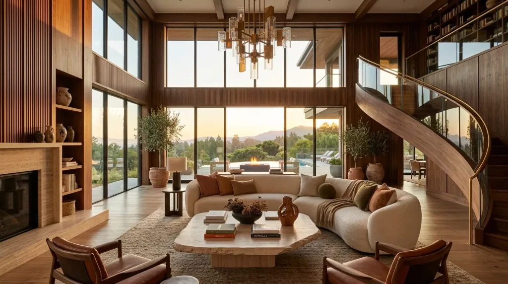
There’s a reason so many people are moving away from stark white walls and cold grey everything. Something deeper is calling — a desire for spaces that feel genuinely warm, rooted, and human. That’s exactly what a warm earthy tones home decor palette delivers. Think terracotta, burnt sienna, warm sand, olive green, and deep ochre — colors that look like they were borrowed directly from nature itself.
This isn’t just a trend. Earth tone interiors have been around for centuries across cultures, from sun-baked Mediterranean homes to Japanese wabi-sabi spaces built around imperfection and natural material. The difference today is that we know more about how to apply these colors skillfully in a modern context.
Whether you’re redecorating your living room, refreshing a bedroom, or just building a palette before your next paint run, this guide covers everything from the ground up.
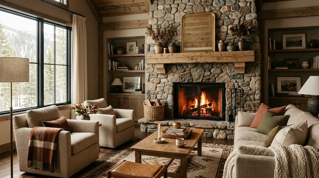
What Exactly Are Warm Earthy Tones in Home Decor?
Before diving into ideas, it helps to understand what actually qualifies as an earthy tone — because not every beige or brown makes the cut.
Warm earthy tones are colors found in the natural landscape: soil, stone, desert sand, dried leaves, clay, bark, and aged copper. They share a few characteristics — warm (yellow, red, or orange) undertones, they’re rarely pure or heavily saturated, and they feel grounded rather than flashy.
Here are the core colors that make up a warm earthy palette:
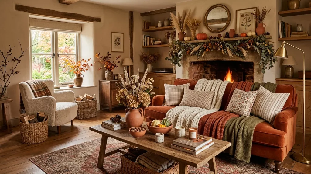
- Terracotta — a fired-clay orange-red, rich and tactile
- Ochre — a golden-yellow with deep pigment, rooted in ancient art
- Warm sand and dune beige — soft, versatile, and endlessly livable
- Rust — a deep, oxidized red-brown that adds dramatic warmth
- Olive green — earthy, botanical, and incredibly harmonious with other earth tones
- Warm taupe — a sophisticated mid-tone between beige and grey with warm undertones
- Raw umber and deep brown — anchoring, grounding, excellent as base tones
- Dusty rose and clay pink — softer earth tones that add warmth without going orange
These colors don’t fight for attention. They layer beautifully, support each other, and create spaces that feel naturally cohesive from the moment you walk in.
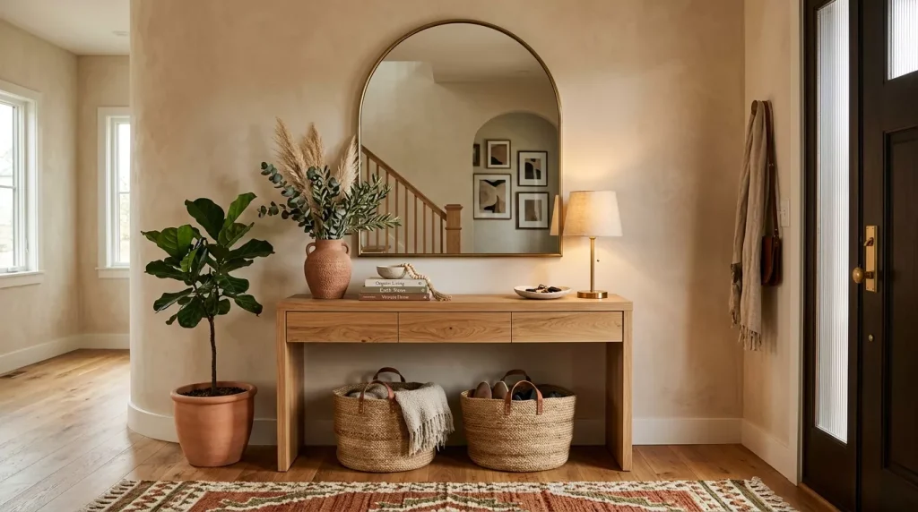
Warm Earthy Tones Home Decor Palette Ideas Room by Room
Living Room: Where Earth Tones Shine Brightest
The living room is the ideal place to go bold with an earthy palette — it’s a social, well-lit space that benefits enormously from warmth and depth.
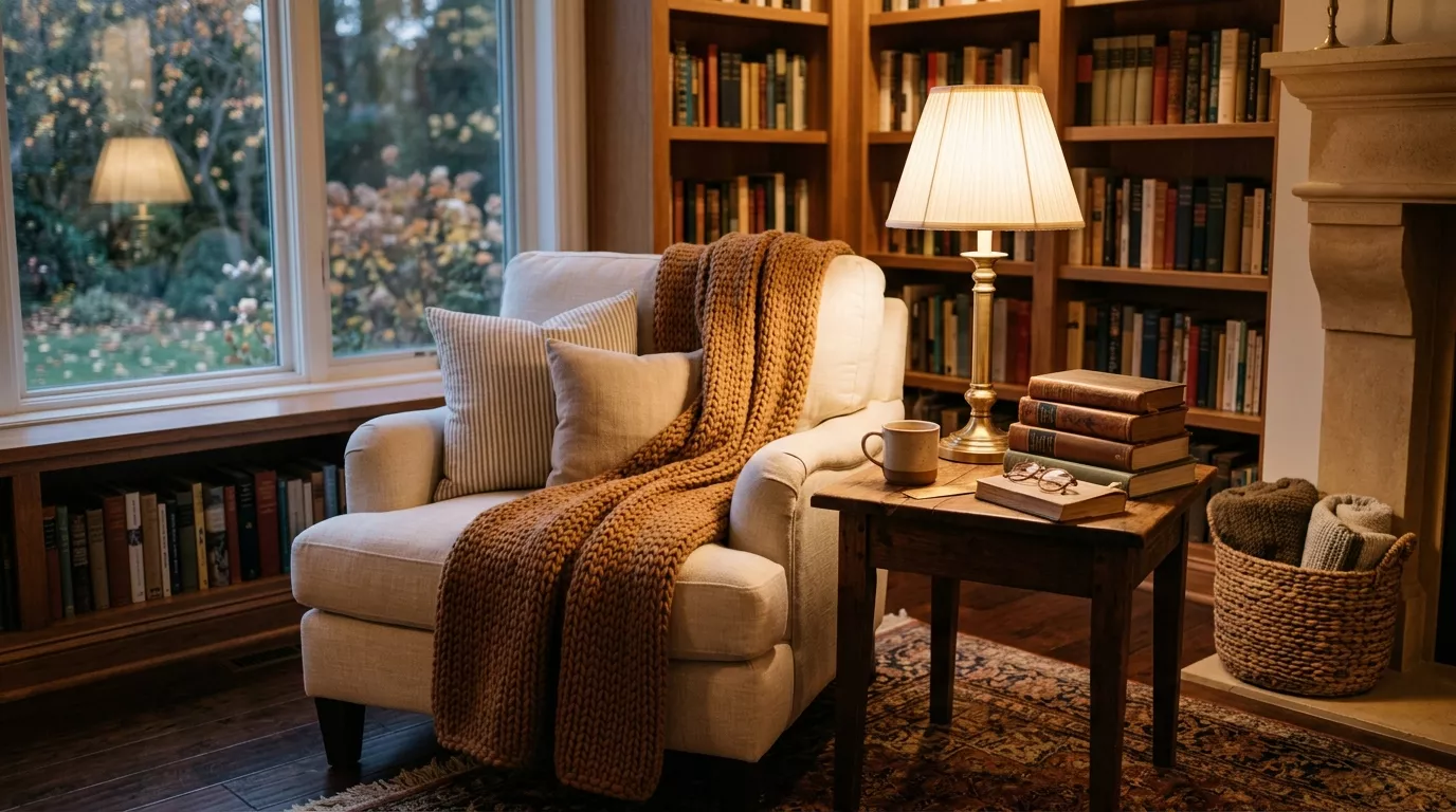
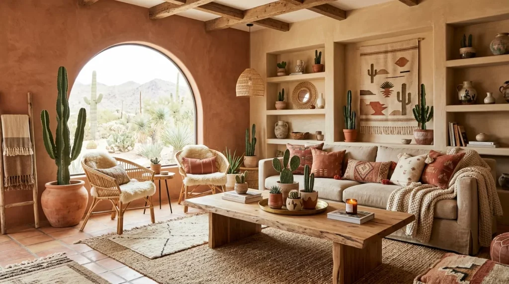
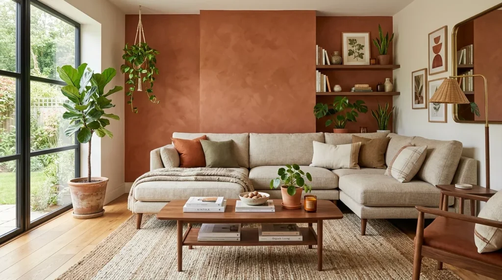
Start with a terracotta or warm sand accent wall as your visual anchor. Against that, a natural linen sofa in oatmeal or wheat reads beautifully, especially layered with rust-toned throw pillows and a chunky woven blanket in deep umber.
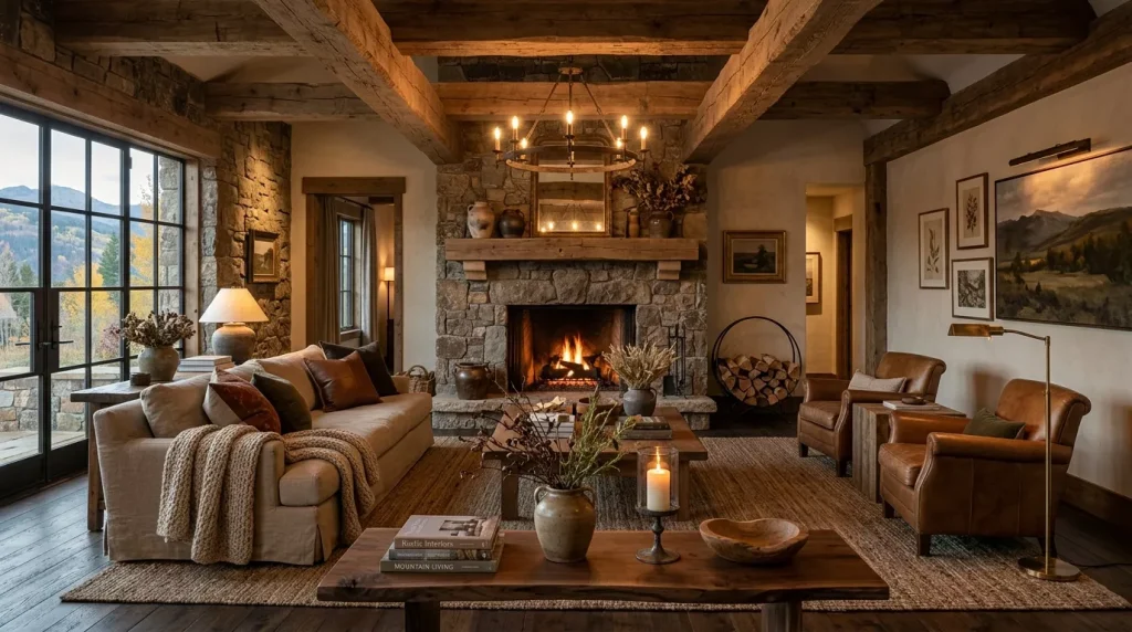
Ground the entire space with a large jute or sisal area rug. For tables, raw wood (live-edge oak or reclaimed pine) or rattan bring in the natural material element that makes earthy rooms feel genuinely complete. Don’t forget greenery — trailing pothos or dried pampas grass in terracotta pots ties the whole botanical thread together.
Bedroom: The Most Restful Earthy Palette Application
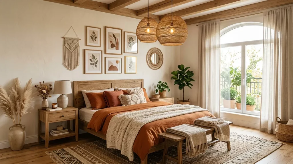
For a bedroom, lean toward the softer end of the earthy spectrum: dusty rose, warm clay, muted ochre, and creamy sand. Layer your bed with linen in warm white, sand, and blush. Add a deep rust or olive velvet throw at the foot for contrast.
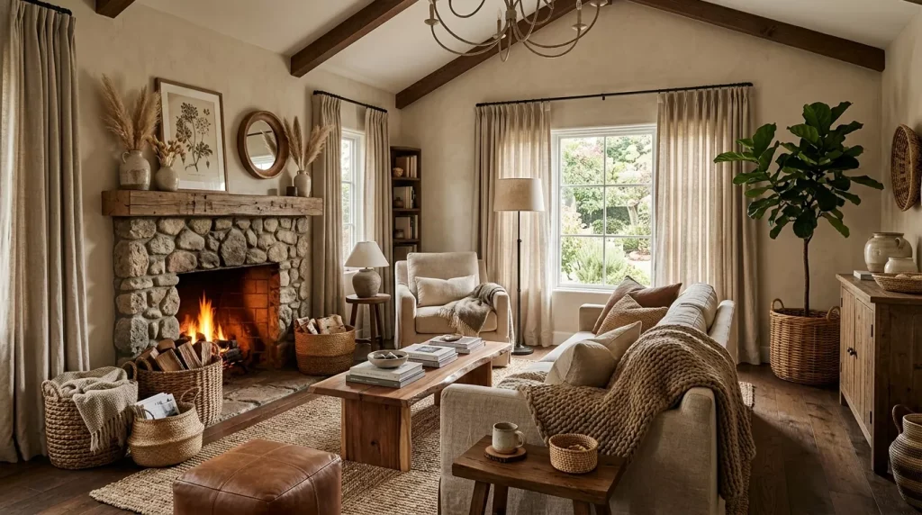
If you want drama, consider one wall in rich warm taupe or deep clay. It adds intimacy to a bedroom in the best possible way without making the space feel heavy.
Warm earth tones and bedrooms are a natural match. The palette is inherently calming — nothing about terracotta walls or warm sand bedding keeps you alert the way cool grey might.
Kitchen and Dining: Earthy Warmth Where It’s Needed Most
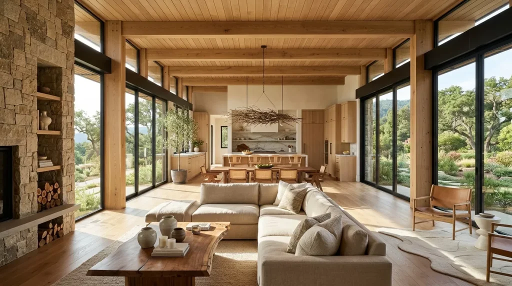
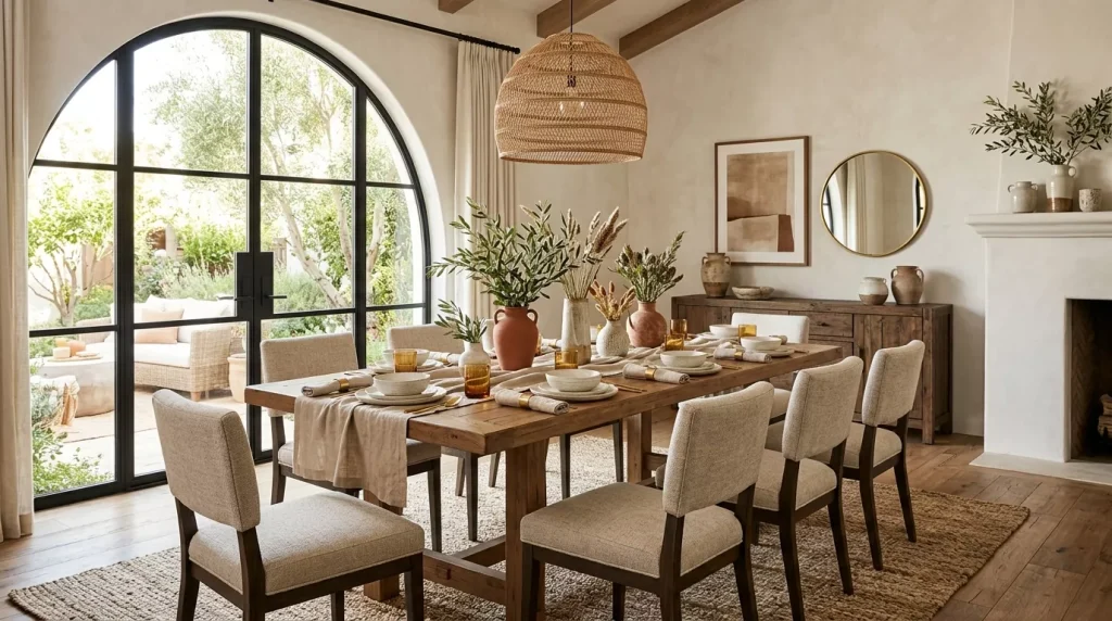
Kitchens and dining rooms benefit enormously from an earthy palette because warmth in these spaces translates directly to hospitality. Terracotta or warm ochre tiles — on the floor or as a backsplash — are striking and practical. They age beautifully and never look dated.
Cabinet colors like warm olive green, dusty clay, or deep warm brown instantly transform a standard kitchen into something with real character. Pair with unlacquered brass hardware for a perfect balance of warm metal and organic color.
How to Build a Warm Earthy Tones Home Decor Palette
Not sure where to begin? Here’s a simple, repeatable framework.
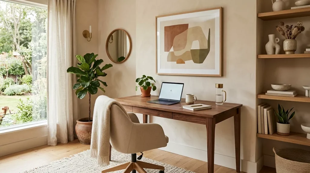
Choose your base tone. This covers the most surface area — usually walls. Warm sand, greige, or warm white are the most versatile. They let accent tones breathe without competing.
Pick your mid-tones. These are your furniture, large textiles, and rugs. Warm taupe, natural linen, aged oak, and warm brown work harmoniously across every room.
Select your accent colors. Terracotta, rust, ochre, or olive green. Use them on throw pillows, ceramics, artwork, and accent chairs.
Add depth with darks. Every earthy palette needs one deep, grounding tone — deep umber, dark walnut, or near-black charcoal used sparingly on frames or light fixtures.
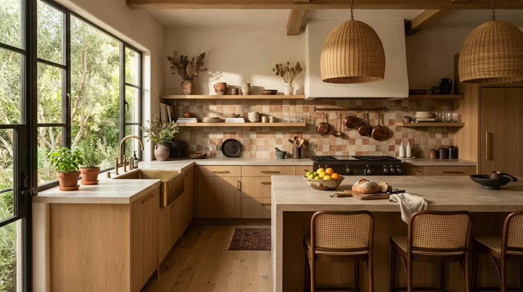
Tie it together with texture. Linen, jute, rattan, raw wood, stone, wool, and leather are the textural vocabulary of earthy interiors. The more natural the material, the more cohesive the palette becomes.
Step-by-Step Guide to Decorating with a Warm Earthy Palette
Step 1: Audit Your Starting Point Walk through your space and note what’s staying (floors, built-ins, existing furniture) and whether those pieces have warm or cool undertones. Warm wood floors and cream walls mean you’re already halfway there.
Step 2: Paint First, Decorate Second Always commit to wall color before buying furniture or textiles. Paint a large swatch directly on the wall and observe it at different times of day — morning light, midday, and evening lamp light can make the same warm sand look completely different at each hour.
Step 3: Build From the Floor Up Choose your rug or flooring treatment next. A large jute, wool, or earthy-patterned rug establishes the palette from the ground and gives you a reference point for every purchase that follows.
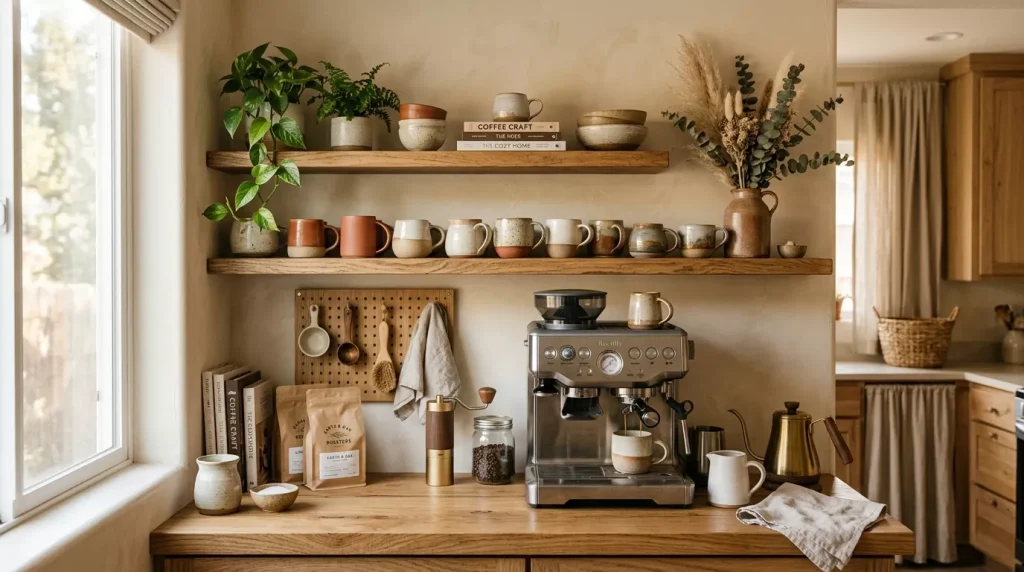
Step 4: Choose Your Anchor Furniture Your sofa, bed frame, or dining table is the largest piece. Choose it in a neutral earthy tone — warm linen, natural leather, oatmeal boucle, or aged wood — so it grounds the palette without locking you into one specific accent color.
Step 5: Layer Textiles and Soft Furnishings Add throw pillows, blankets, and curtains in your chosen accent tones (terracotta, rust, ochre). This is the most affordable layer to change if you want to refresh the look seasonally.
Step 6: Add Lighting and Metals Warm-toned metals — unlacquered brass, aged bronze, raw copper — complement earthy palettes perfectly. Replace cool chrome fixtures with warm metal alternatives and switch bulbs to 2700K–3000K colour temperature to make every earth tone glow.
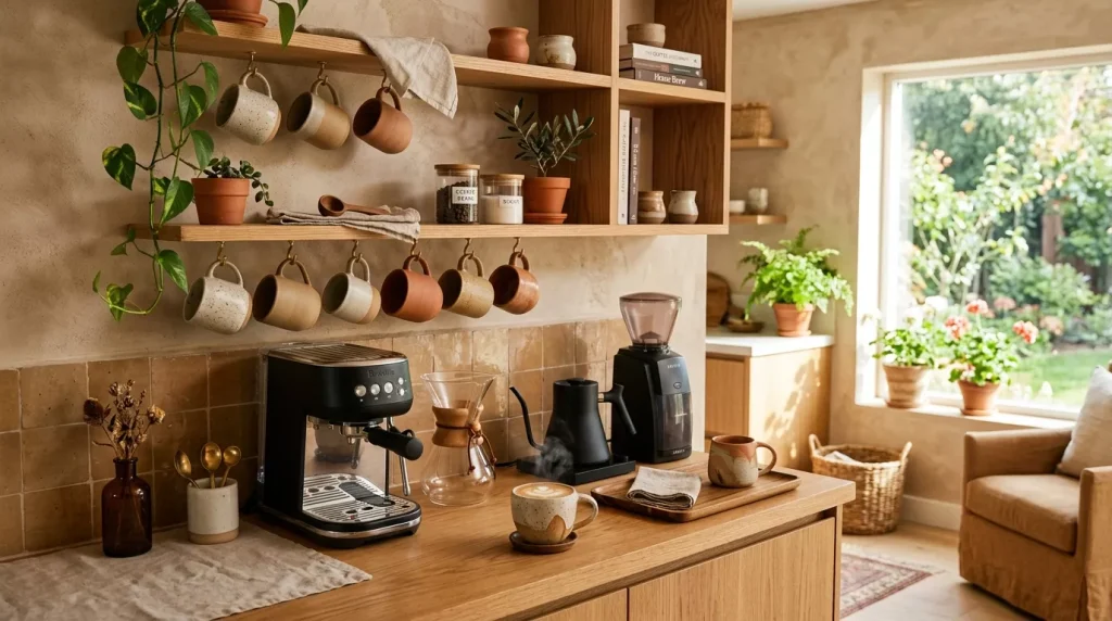
Step 7: Finish with Plants and Ceramics Terracotta plant pots, ceramic vases in clay tones, dried botanicals, and live plants bring the earthy theme full circle. These small details are often what make a room feel genuinely curated rather than simply decorated.
Materials That Work Best with Warm Earthy Tones
| Material | Best Use | Why It Works |
|---|---|---|
| Raw linen | Curtains, sofa covers, pillows | Naturally warm, textured, breathes well |
| Jute / Sisal | Area rugs, baskets, lampshades | Organic texture, perfect earthy anchor |
| Rattan / Cane | Chairs, headboards, pendant lights | Lightweight botanical warmth |
| Reclaimed wood | Tables, shelving, flooring | Warm grain adds character and depth |
| Natural leather | Sofas, cushions, ottomans | Ages beautifully, adds richness |
| Terracotta ceramic | Vases, plant pots, tableware | Direct extension of the earth tone palette |
| Wool / Boucle | Throws, accent chairs | Cozy texture that amplifies warmth |
| Unlacquered brass | Hardware, fixtures, frames | Warm metallic that suits every earth tone |
Warm Earthy Palette vs. Other Popular Home Decor Palettes
| Palette | Mood | Strength | Limitation |
|---|---|---|---|
| Warm Earthy Tones | Grounded, cozy, timeless | Works in every room, very livable | Can feel heavy in low-lit small spaces |
| All-White Minimalist | Clean, fresh, airy | Makes spaces feel larger | Feels cold; shows dirt easily |
| Cool Grey & White | Modern, sleek, neutral | Safe and widely appealing | Lacks warmth; can feel clinical |
| Jewel Tones | Bold, dramatic, luxurious | High visual impact | Hard to balance; can overwhelm |
| Scandi Pale Neutrals | Calm, light, airy | Bright and easy to live with | Can feel flat or impersonal |
Warm earthy tones consistently outperform other palettes in long-term livability. They don’t date quickly, they improve with layering, and they suit almost every architectural style — from a modern apartment to an older cottage.
Pros and Cons of a Warm Earthy Tones Home Decor Palette
✅ Pros
- Timelessly stylish — used across cultures for millennia and resistant to trend cycles
- Extremely versatile — works in every room and with a wide range of furniture styles
- Creates genuine warmth — psychologically promotes comfort, calm, and relaxation
- Forgiving and layerable — earth tones are easy to mix, match, and add to over time
- Suits natural materials — wood, stone, linen, rattan, and leather all look their best against earthy backdrops
- Budget-flexible — achievable at any price point by focusing on paint and textiles first

❌ Cons
- Can feel heavy in poorly lit rooms — dark earth tones need good light to avoid feeling oppressive
- Requires careful undertone matching — warm undertones must align throughout; mixing warm and cool reads as a mistake
- Less dramatic than bold palettes — if you love high visual contrast, a purely earthy palette can feel too quiet
- Easy to drift into “dated cottage” territory — without modern lines and intentional editing, overly rustic earthy decor can feel dated rather than designed
Common Mistakes to Avoid
1. Mixing warm and cool tones unintentionally. A terracotta wall paired with cool grey upholstery creates visual tension that feels wrong without you quite knowing why. Always check the undertones of every piece before committing.
2. Going all brown with no contrast. A room that’s entirely brown, beige, and tan reads flat and uninspiring. Every earthy palette needs at least one contrasting moment — a deep accent, a graphic print, or a pop of olive green.
3. Ignoring texture variety. Earth tone palettes live and die by textural layering. Earthy colors in a room full of flat, smooth surfaces miss the point entirely. Mix rough, smooth, woven, and soft textures for real depth.
4. Over-accessorizing with terracotta. Terracotta is beautiful but powerful. When every surface has a terracotta pot, tile, cushion, and candle, it quickly becomes overwhelming. Use it as a standout accent, not a base color.
5. Choosing the wrong white. If you’re using white as a balancing neutral, always choose a warm white — cream, bone, or antique white. A cool or blue-toned white clashes with every warm earthy tone in the room and undermines the entire palette.
Pro Tips for a Warm Earthy Home Decor Palette
- Test paint on a large swatch — not a small chip. Paint at least an A3-sized patch on the actual wall and observe it at morning, midday, and evening before deciding.
- Shop secondhand first — earthy tone decor (rattan chairs, wooden bowls, vintage ceramics) is abundantly available in vintage and thrift markets at a fraction of retail price.
- Embrace dried botanicals — pampas grass, dried eucalyptus, and wheat sheaves are inexpensive, long-lasting, and deeply tied to the earthy aesthetic.
- Use the 60-30-10 rule — base tone at 60%, mid-tones at 30%, and your deepest earthy accent at 10% for natural balance.
- Warm your lightbulbs — switching to 2700K–3000K bulbs throughout your home makes every earthy tone glow. Cool white light flattens them completely.
Conclusion
A warm earthy tones home decor palette is more than just a design trend — it’s a return to something fundamental. It’s the visual language of shelter, warmth, and belonging. When your home uses the same tones the natural world does, it stops feeling like a showroom and starts feeling like an extension of you.
The beauty of this palette is in its flexibility. You can lean boldly into terracotta or stay quietly sandy and soft. You can mix boho rattan with sleek modern furniture, or combine wabi-sabi imperfection with minimal, precise styling. Earth tones are forgiving enough to hold all of it.
Start small if this palette is new to you. A terracotta throw, a jute rug, a warm olive cushion. Watch how quickly your space begins to transform. Then, when you’re ready, go deeper — repaint a wall, swap out hardware, invest in that hand-thrown ceramic lamp you’ve been admiring.
Your home should feel like somewhere you genuinely want to be. Pick one earthy element from this guide and start today — your most comfortable, grounded living space is closer than you think.
Frequently Asked Questions (FAQs)
Q1: What are the best warm earthy tone paint colors for a living room?
Some of the most livable and popular choices include warm sand (think colors in the cream-to-wheat range), terracotta shades (burnt orange-clay tones), and warm taupe. Always test in your actual space — undertones change dramatically depending on your light source and flooring material.
Q2: How do I stop an earthy palette from feeling too dark or heavy?
Balance is everything. Use your darkest earth tones sparingly as accents. Keep walls and large surfaces in lighter tones — warm sand, soft clay, or warm white. Maximize natural light, add mirrors to reflect it, and use warm-toned artificial lighting at 2700K–3000K for evenings.
Q3: Can earthy tones work in a small apartment or studio?
Absolutely. Stick to lighter earth tones — warm sand, dusty rose, pale clay — on walls and large furniture to keep the space feeling open. Add deeper earthy accents through textiles and smaller decor so you get the warmth without the visual weight.
Q4: What accent colors work best with warm earthy tones?
The best accents stay within the natural spectrum. Deep forest green, dusty sage, burgundy, and warm ivory all integrate beautifully. For metallics, unlacquered brass, aged bronze, and raw copper are ideal. Avoid cool accents like silver, chrome, or electric blue — they clash with warm undertones.
Q5: Is the earthy home decor trend here to stay or will it date quickly?
Earth tones are one of the most enduring palettes in design history. What shifts are the specific shades most prominent in a given season, but the palette itself is as timeless as the natural world it draws from. A well-executed earthy interior will still look relevant a decade from now.
Q6: What’s the easiest way to add earthy tones without repainting?
Textiles are your fastest, most affordable option. Swap throw pillows, blankets, and curtains for earthy-toned alternatives. Add a jute rug, replace chrome hardware with brushed brass, bring in terracotta plant pots, and layer natural wood objects on shelving. You can transform a room significantly without touching a single wall.