Two Tone Kitchen Cabinet Ideas That Wow Every Time

Two Tone Kitchen Cabinet Ideas That Actually Work in Real Kitchens
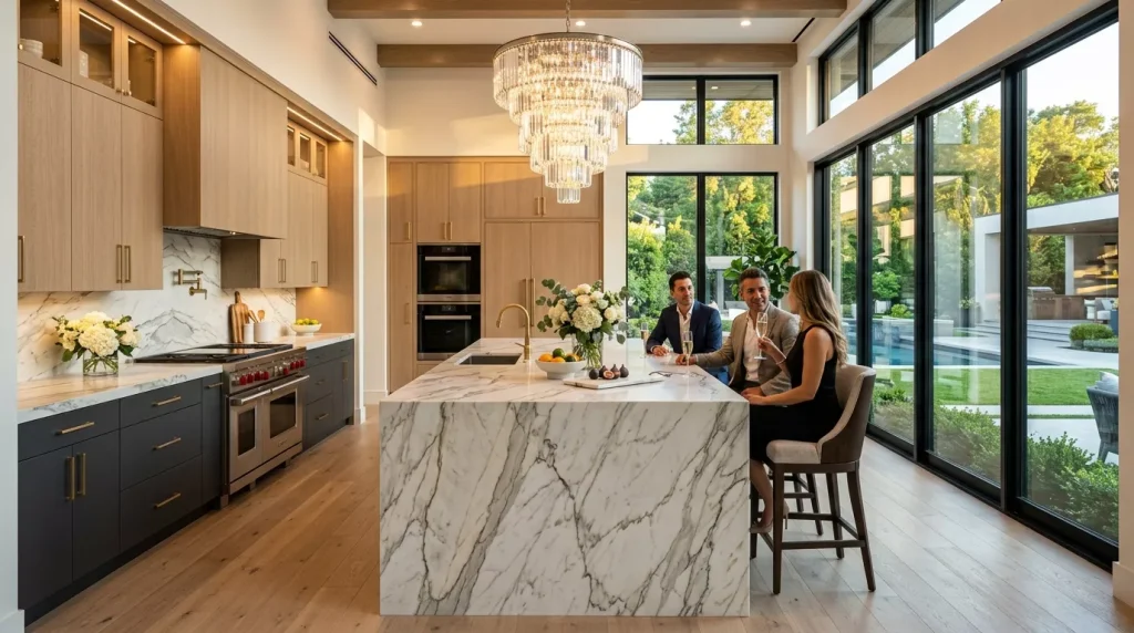
If you’ve been scrolling through kitchen renovation photos lately, you’ve probably noticed that the all-white or all-grey cabinet look is slowly making room for something more interesting. Two tone kitchen cabinet ideas are everywhere right now — and honestly, it’s one of the most transformative design moves you can make without a full gut renovation.
The concept is simple: use two different colors or finishes on your upper and lower cabinets, or on your island versus your perimeter cabinetry. But the execution is what separates a kitchen that looks intentional and polished from one that feels like an accidental mismatch.
This guide walks you through everything — color pairings, layout strategies, common pitfalls, and the step-by-step approach to getting it right the first time.
Why Two Tone Kitchen Cabinets Are Worth Considering
Let’s start with the honest version of why this trend has legs beyond just looking good in photos.
Single-color kitchens can feel flat — especially in open-plan spaces where the kitchen connects to a dining or living area. A second color adds depth, breaks up visual monotony, and gives the eye somewhere to travel. It also lets you introduce personality without committing to an extreme design choice.
There’s also a practical angle. If your existing lower cabinets are still in great shape but your uppers are dated, painting just the uppers a fresh color is far more cost-effective than a complete replacement. Two tone isn’t just a style — it’s sometimes the smart budget move.
And from a resale standpoint, a well-executed two tone kitchen photographs beautifully and tends to stand out in listings. That matters more than people think.
The Most Popular Two Tone Kitchen Cabinet Color Combinations
Color selection is where most people freeze up. The good news is there are some tried-and-true pairings that consistently look great across different kitchen styles and sizes.
Classic and Safe Combinations
These work in almost any kitchen because the contrast is balanced rather than jarring:
- White uppers + navy lowers — the most popular combination right now for good reason. Clean, crisp, and sophisticated without trying too hard.
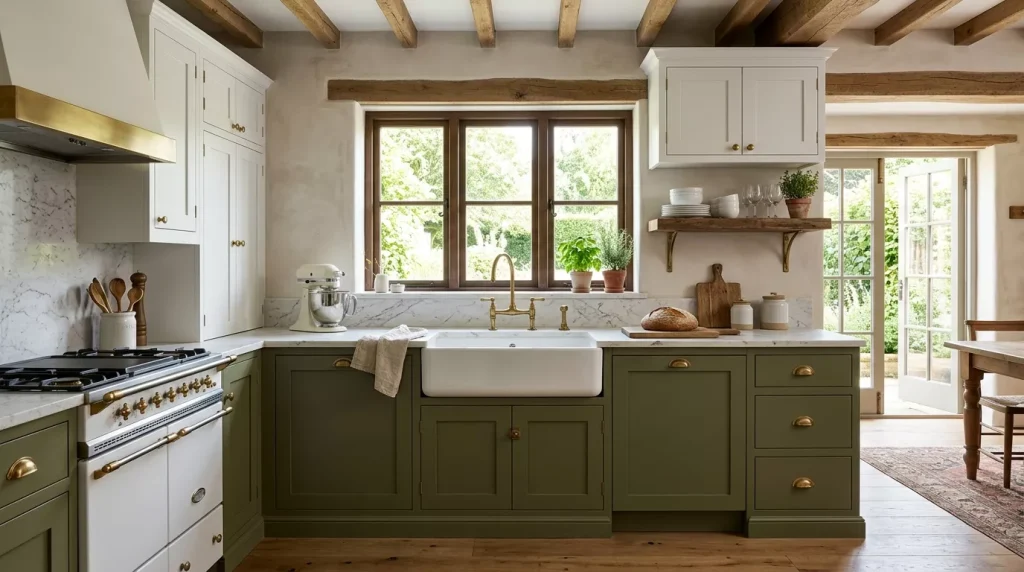
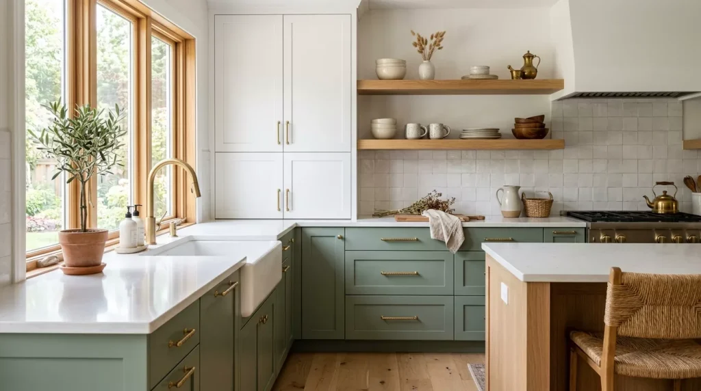
- White uppers + sage green lowers — softer and more organic; works beautifully in farmhouse and transitional kitchens.
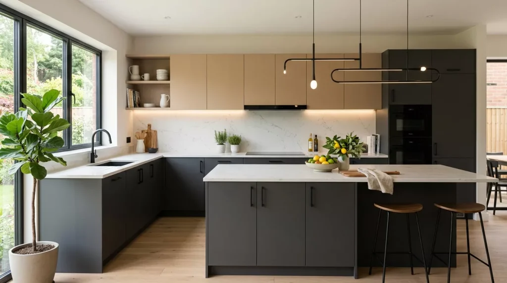
- Light grey uppers + dark charcoal lowers — a tonal approach that’s subtle but still interesting. Great for modern and minimalist spaces.
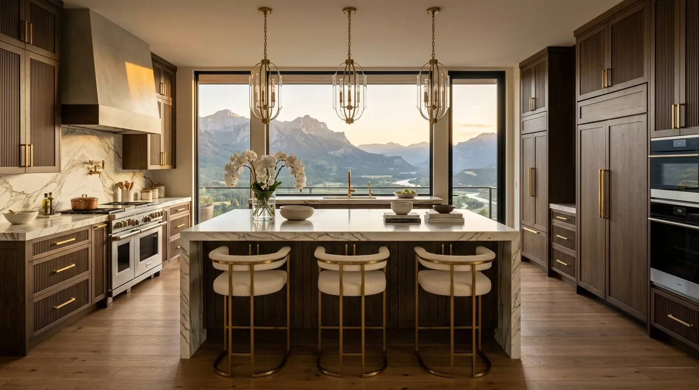
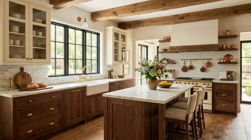
- Cream uppers + warm wood tone lowers — feels timeless and warm; pairs well with stone countertops.
Bold and Statement Combinations
These take more confidence but can be stunning when executed correctly:
- Black uppers + white lowers — inverted from what most people expect, and surprisingly dramatic.
- Dusty blue uppers + warm greige lowers — unexpected and cozy; works in eclectic or coastal kitchens.
- Deep forest green uppers + brass-detailed white lowers — rich and layered; leans into a jewel-toned aesthetic.
- Terracotta lowers + off-white or warm white uppers — very current, especially in kitchens with warm lighting and natural textures.
Tonal Two Tone (Same Color Family, Different Shades)
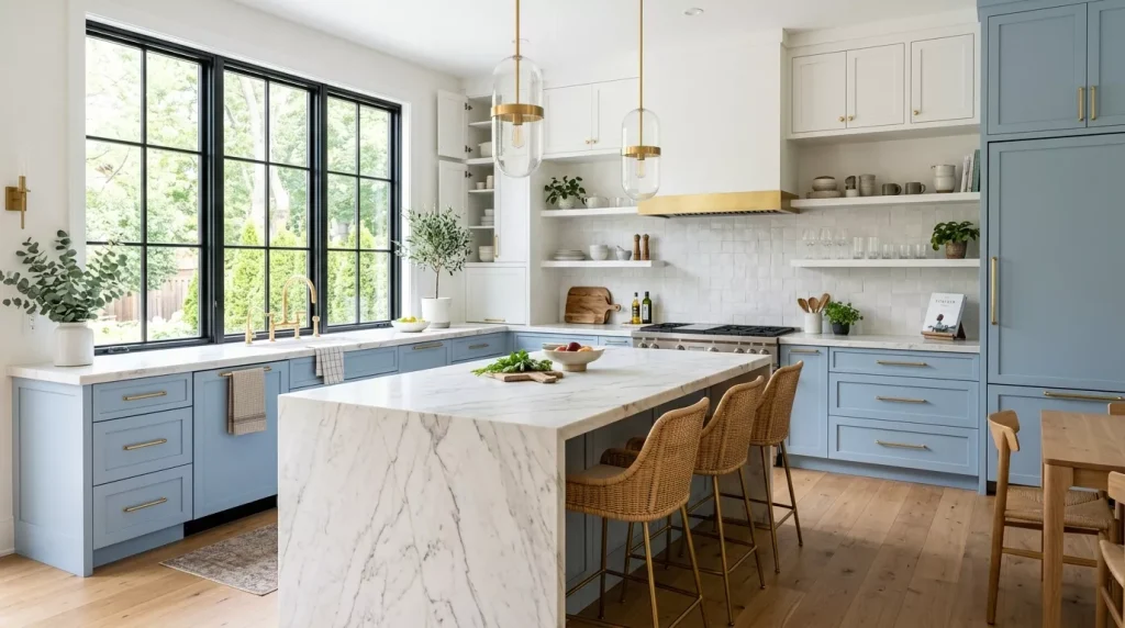
This is the most understated approach — different shades of the same hue rather than two distinct colors. Think pale blue uppers with a deeper navy lower, or soft sage uppers with a richer forest green island. The result feels cohesive and sophisticated rather than dramatically contrasted.
Two Tone Kitchen Cabinet Ideas by Kitchen Layout
The way your kitchen is laid out should influence how you approach the two tone concept. Not every configuration calls for the same split.
Upper vs. Lower Cabinet Split
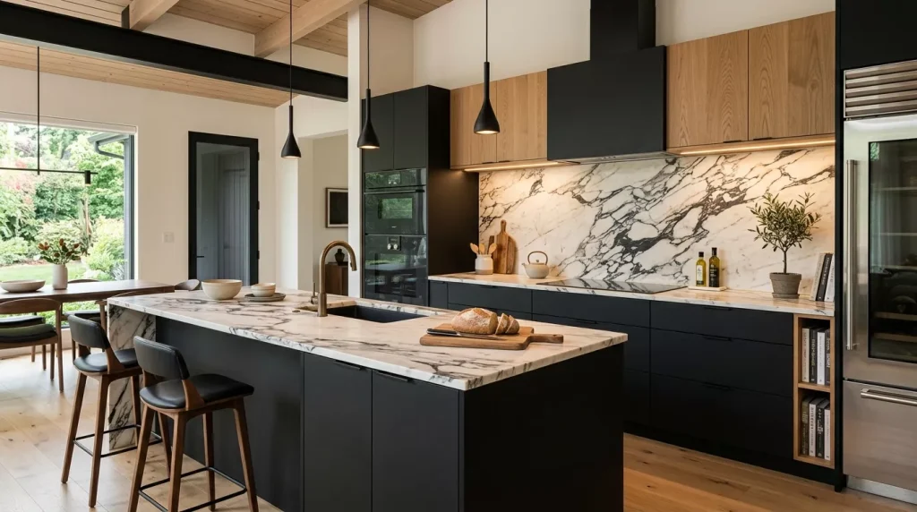
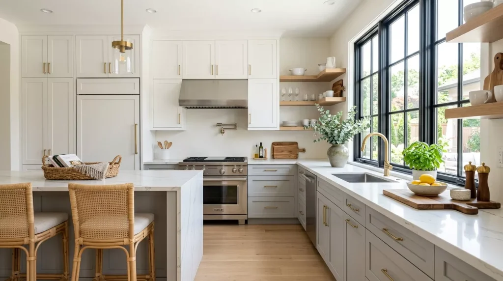
The most common approach. Upper cabinets in a lighter color, lower cabinets in a darker or bolder shade. This works because it follows the natural logic of how color works in a room — lighter shades above feel airy, darker shades below feel grounded.
It’s also the most forgiving option if you’re doing this for the first time. The contrast is clear, the logic makes sense visually, and it’s relatively easy to explain to a painter.
Island vs. Perimeter Split
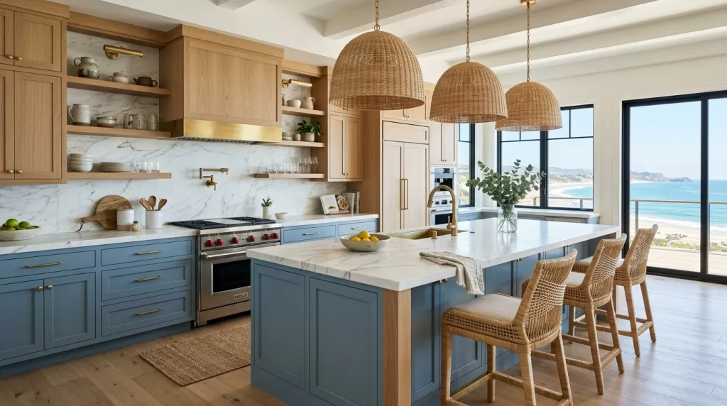
A contrasting kitchen island is arguably the most impactful single design choice you can make in a kitchen with an island. Keep your perimeter cabinets in a neutral (white, grey, or cream) and paint or refinish the island in a bold accent color.
Navy, black, deep green, or warm wood are the most popular island colors right now. The island becomes the focal point, and everything else supports it.
Base Cabinets Only Split (Accent Section)

Some kitchens — particularly galley or L-shaped layouts — don’t have a natural division between uppers and lowers that calls for a full two tone treatment. In these cases, painting one section of base cabinets (like the section under a window or along one wall) in a different color creates a deliberate accent without breaking up the visual flow.
Two Tone Kitchen Cabinet Color Pairing Reference Table
| Upper Cabinet Color | Lower Cabinet Color | Style Fit | Difficulty Level |
|---|---|---|---|
| Bright white | Navy blue | Transitional, coastal | Easy |
| Soft white | Sage green | Farmhouse, organic modern | Easy |
| Light grey | Charcoal | Modern, minimalist | Easy |
| Cream / off-white | Warm walnut | Traditional, transitional | Medium |
| White | Forest green | Eclectic, bold traditional | Medium |
| Off-white | Terracotta | Boho, Mediterranean | Medium |
| Pale blue | Deep navy | Coastal, tonal | Medium |
| Greige | Matte black | Industrial, contemporary | Medium |
| Black | White | Bold modern, dramatic | Advanced |
| Two-tone wood tones | Mixed stain finishes | Rustic, organic | Advanced |

Step-by-Step Guide: Planning Your Two Tone Kitchen Cabinet Makeover
Whether you’re repainting existing cabinets or starting fresh, the process benefits from a clear plan. Here’s how to approach it without making expensive mistakes.
Step 1: Assess your existing kitchen. Before choosing colors, look at what you already have — countertop material and color, flooring, backsplash, hardware finish, and appliance color. Your two tone palette needs to work with these existing elements, not fight against them.
Step 2: Choose your anchor color first. One of the two colors should be your “safe” choice — a neutral or near-neutral that grounds everything else. The second color is where you can take more of a risk. Don’t try to make both colors bold at once.
Step 3: Order samples and live with them. Paint a large swatch (at least 12×12 inches) on your actual cabinet doors and leave it for 2–3 days. Look at it in morning light, afternoon light, and under your kitchen lighting at night. Colors shift dramatically in different lighting conditions, and what looks perfect in a showroom can look completely different at home.
Step 4: Decide on hardware. Hardware finish ties the two colors together. Brushed brass works beautifully with navy and white. Matte black hardware suits green, charcoal, and warm tones. Chrome reads as clean and modern. Pick one hardware finish and use it consistently across both cabinet colors.
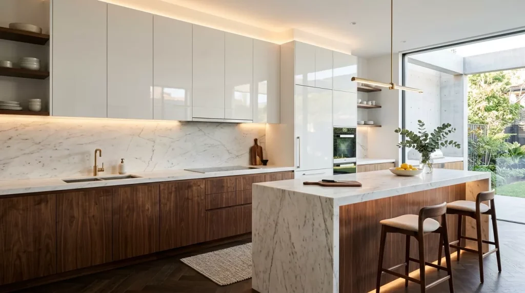
Step 5: Plan the paint finish. For kitchen cabinets, a semi-gloss or satin finish is generally the right call. It’s wipeable, durable, and reflects just enough light to look polished without being as high-maintenance as a gloss finish. Flat or eggshell is too porous for a kitchen environment.
Step 6: Prep the cabinets properly. If you’re DIY painting, this step makes or breaks the result. Clean all cabinet surfaces thoroughly, sand lightly to scuff the existing finish, apply a bonding primer, and then paint in thin, even coats. Rushing prep leads to peeling, brush marks, and a finish that doesn’t last.
Step 7: Add the finishing touches. New hardware, updated lighting, and a considered backsplash can complete the transformation. Sometimes the cabinets don’t even need to change — it’s the combination of all these elements that makes the kitchen feel new.
Pros and Cons of Two Tone Kitchen Cabinets
Pros
- Adds visual depth and dimension — breaks up large kitchens that would feel flat with a single color
- Highlights specific features — makes islands, pantry sections, or open shelving units stand out
- Cost-effective refresh — repainting a portion of cabinets is cheaper than replacing them
- Highly customizable — endless color and finish combinations mean it works in any style
- Improves resale photography — contrasting cabinets show up beautifully in real estate listings
- Design flexibility — you can update one section without redoing the whole kitchen
Cons
- Harder to execute than single-color — poor color choices or uneven paint application are very visible
- Can feel dated if trends shift — some bold combinations may feel very “of this era” in 10 years
- Mismatched hardware risk — using different hardware on different cabinet colors looks unfinished
- Requires more planning — spontaneous color choices almost always lead to regret
- May not suit very small kitchens — in a tiny galley kitchen, too much contrast can feel busy
Tips for Nailing the Two Tone Cabinet Look

- Lighter color on top, darker below is the most reliable formula. It mirrors how light naturally works in a room and rarely goes wrong.
- Repeat one of the cabinet colors elsewhere in the room. If your lower cabinets are navy, bring in navy through a pendant shade, a bar stool cushion, or even a piece of art nearby. Repetition makes a color feel intentional.
- Don’t match the wall color to either cabinet color exactly. A slight contrast between the wall and the upper cabinets keeps the room from looking like everything is bleeding together.
- Consider the ceiling height. In rooms with lower ceilings, very dark upper cabinets can feel oppressive. Lighter uppers keep things feeling open.
- Take photos of your kitchen before you start and use them as a reference when selecting colors at the paint store. Bring a cabinet door or a sample of your countertop if possible.
- Test on the inside of a cabinet door first before committing to the exterior. It’s a low-stakes way to check how the color looks against your specific cabinet material.

Common Mistakes to Avoid
Choosing colors from a screen only. Monitor brightness and color calibration vary wildly. A navy that looks deep and rich on your phone can come out almost black or surprisingly bright in real life. Always get physical paint chips or order sample pots.
Going too matchy-matchy with the countertop. If you have a white marble countertop with grey veining, painting your lower cabinets grey to “match” the veining usually looks like an accidental coordination rather than a deliberate choice. Contrast tends to look more intentional.
Using the same finish on both colors. Actually, this one’s not a mistake — it’s recommended. Mixing finishes (one glossy, one matte) between your upper and lower cabinets creates visual tension that’s rarely flattering. Keep the sheen consistent.
Ignoring the backsplash. Your backsplash will be sandwiched between the two cabinet colors. A busy or colorful backsplash can get completely lost — or worse, clash. If you’re doing a bold two tone combination, lean toward a simpler backsplash. If your cabinets are more neutral, a statement tile can shine.
Skipping the primer. This is the number one reason DIY cabinet paint jobs look bad within a year. Bonding primer is not optional — it’s what makes the topcoat adhere properly and prevents chipping.

Making both colors equally bold. Two competing strong colors create visual chaos. The rule of thumb: one confident color, one that plays a supporting role. The supporting color doesn’t have to be boring — even a warm cream or a textured wood tone is interesting while still being balanced.
Two Tone Cabinets vs. Single Color Cabinets: A Direct Comparison
| Factor | Two Tone Cabinets | Single Color Cabinets |
|---|---|---|
| Visual interest | High | Medium |
| Execution difficulty | Higher | Lower |
| Color trend longevity | Medium | Higher (neutrals last) |
| Cost (DIY repaint) | Similar | Slightly lower |
| Customization options | Extensive | Moderate |
| Best for small kitchens | Sometimes | More often |
| Photography / listing appeal | Very high | High (if neutral) |
| Risk of getting it wrong | Higher | Lower |
The truth is that neither approach is objectively better — it comes down to your kitchen’s proportions, your personal style, and how much design confidence you have. Single color is safer. Two tone is more rewarding when done well.
Conclusion: Time to Bring Your Two Tone Kitchen Cabinet Ideas to Life
Two tone kitchen cabinet ideas work because they do something that’s surprisingly hard to achieve in a kitchen — they create a space that feels both designed and livable at the same time. Not too precious, not too plain.
The key is to approach it methodically. Start with your existing elements, choose your anchor color first, sample in real light, and keep your hardware finish consistent. From there, the combinations are genuinely endless — from the crowd-pleasing white-and-navy to something more unexpected like sage and terracotta.
Whether you’re doing a full kitchen renovation or just looking for a refresh that doesn’t require replacing a single cabinet box, the two tone kitchen cabinet approach gives you more design leverage than almost anything else at that price point.
Ready to start? Pull out your phone, take a photo of your current kitchen, and overlay those color swatches. Your dream kitchen is probably closer — and more affordable — than you think. Start with samples, trust the process, and don’t rush the color decision. That patience is what separates a kitchen you love from one you immediately want to redo.
FAQs About Two Tone Kitchen Cabinet Ideas
Q1: Do two tone kitchen cabinets work in a small kitchen?
They can, but you need to be thoughtful about contrast level. In a small kitchen, high contrast (like black lowers and white uppers) can chop the space visually and make it feel even smaller. A tonal approach — two shades of the same color — gives you the two tone effect without dividing the room sharply. Light uppers and a slightly deeper shade on the lowers is the most small-kitchen-friendly version.
Q2: Should upper or lower cabinets be darker?
In most cases, darker on the bottom and lighter on top is the most visually balanced approach. It mirrors the way color naturally reads in architecture — lighter above, heavier below — and it makes ceilings feel higher. That said, the reverse (dark uppers, light lowers) can work in rooms with very high ceilings or in deliberately dramatic, moody kitchens.
Q3: What is the most popular two tone kitchen cabinet combination right now?
White uppers paired with navy blue lowers is consistently the most searched and most executed two tone combination. It’s followed closely by white uppers with sage green lowers and cream uppers with a warm wood tone on the island or lowers. These combinations have staying power because they’re rooted in classic color theory rather than a passing micro-trend.
Q4: Can I do two tone cabinets without repainting — just by changing hardware?
Not technically a two tone approach, but swapping hardware is a great way to add visual contrast without committing to paint. For a true two tone look, you do need two distinct colors or finishes on the cabinet surfaces themselves. However, if you want to test the concept on a small budget first, painting just the island a different color while leaving the perimeter cabinets as-is is a low-risk starting point.
Q5: How much does it cost to get a two tone kitchen cabinet paint job done professionally?
Professional cabinet painting typically runs $1,500–$5,000+ depending on kitchen size, number of doors, and the complexity of the job. A two tone treatment may add 10–20% to the total cost because it requires careful masking between the two colors and potentially separate coats of primer and topcoat for each color. DIY costs are primarily materials — paint, primer, supplies — which can run $200–$600 for a full kitchen.
Q6: What paint finish is best for kitchen cabinets?
Semi-gloss and satin are the two best options for kitchen cabinets. Semi-gloss is slightly more durable and easier to wipe clean; satin has a softer sheen that hides imperfections better. Both are more practical than eggshell or flat finishes, which absorb grease and moisture and are difficult to clean without dulling the surface. High-gloss works but shows every fingerprint and brush stroke.
Q7: Can two tone cabinets go out of style?
Like any design choice, bold color combinations can feel dated over time. However, the concept of two tone cabinets itself is not a trend — it’s a design principle with roots going back decades. The specific color pairings may evolve, but the approach of differentiating uppers from lowers or island from perimeter is likely to remain relevant. Sticking to classic combinations (navy/white, sage/cream, wood tones with painted cabinets) gives you the most longevity.